Primary And Secondary Colors In Art: The Ultimate Guide For Beginners
Color is arguably the most powerful tool in an artist’s arsenal. It has the unique ability to evoke emotion, create depth, and direct the viewer’s eye. However, for a beginner, the sheer vastivity of the color spectrum can be overwhelming. Understanding the relationship between primary and secondary colors is the foundational step toward mastering artistic expression.
In this comprehensive guide, you will learn the mechanics of color theory, the science of mixing pigments, and practical strategies to use these colors effectively in your creative projects. Whether you are picking up a brush for the first time or looking to refine your technical knowledge, this guide serves as your roadmap to color mastery.
1. The Foundation: What Are Primary Colors?
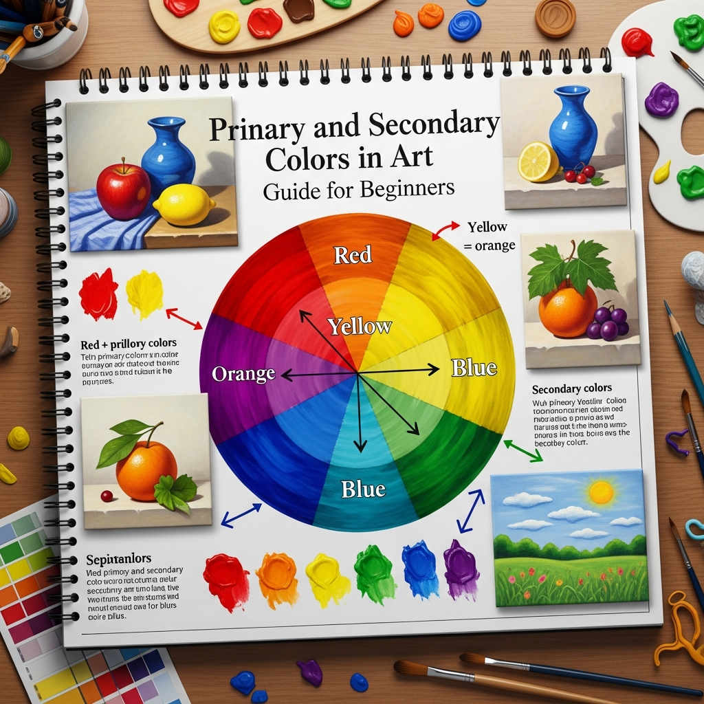
At the very core of color theory lie the primary colors. These are considered the “parent” colors because they cannot be created by mixing any other colors together. In the traditional world of art—specifically when dealing with paints and pigments—the three primary colors are:
- Red
- Yellow
- Blue
This is often referred to as the RYB color model. In this model, these three hues are the building blocks for every other color you see on a canvas.
Why Are They “Primary”?
The term “primary” signifies their status as the origin point. If you were stranded on a deserted island with only tubes of red, yellow, and blue paint (plus white and black), you could theoretically recreate almost the entire visible spectrum. You cannot “break down” red to find other colors inside it; it is an elemental hue.
The Science of Pigment vs. Light
It is important for you to distinguish between the color models used in different fields. While artists use RYB, digital screens use RGB (Red, Green, Blue), and printers use CMYK (Cyan, Magenta, Yellow, and Key/Black). As a beginner in traditional art, focusing on the RYB model is the most practical approach for mixing physical paints like acrylics, oils, or watercolors.
2. The Bridge: Understanding Secondary Colors
Once you have grasped the concept of primary colors, the next step is exploring secondary colors. These are the colors that emerge when you mix two primary colors in equal proportions.
The three secondary colors are:
- Orange (Created by mixing Red and Yellow)
- Green (Created by mixing Yellow and Blue)
- Purple / Violet (Created by mixing Blue and Red)
The Logic of the Mix
The transition from primary to secondary is a mathematical certainty in the world of art.
- Red + Yellow = Orange: Depending on the ratio, you can create a vibrant “cadmium” orange or a subtle “burnt” orange.
- Yellow + Blue = Green: This is perhaps the most diverse secondary color, ranging from lime green to deep forest green depending on the specific blue and yellow used.
- Blue + Red = Purple: Achieving a clean purple can be tricky for beginners, as many “primary” reds contain a hint of yellow, which can dull the resulting violet.
3. Visualizing Relationships: The Color Wheel
To understand how these colors interact, you must look at the Color Wheel. First developed by Sir Isaac Newton in 1666, the color wheel is a circular diagram that maps the relationships between hues.
The Structure of the Wheel
On a basic 12-part color wheel:
- The Primary Colors are placed at equal distances from each other, forming an equilateral triangle.
- The Secondary Colors are placed exactly between the primaries that create them.
- The remaining gaps are filled by Tertiary Colors (e.g., Red-Orange, Blue-Green), which are made by mixing a primary and a secondary color.
Why the Wheel Matters to You
The color wheel is not just a chart; it is a strategic tool. It helps you identify Complementary Colors (colors directly opposite each other, like Blue and Orange) and Analogous Colors (colors next to each other, like Blue, Blue-Green, and Green). Using the wheel allows you to predict how colors will look when placed side-by-side or mixed together.
4. Step-by-Step Guide: How to Mix Primary and Secondary Colors
Mastering the physical act of mixing is different from understanding the theory. Follow these steps to practice your color mixing effectively:
Step 1: Prepare Your Palette
Place a small amount of Primary Red, Primary Yellow, and Primary Blue on your palette. Ensure there is plenty of space between them to avoid accidental contamination.
Step 2: Creating Orange
Take a small amount of yellow and move it to a clean area of the palette. Gradually add a tiny amount of red. Always add darker colors to lighter colors, as dark pigments overpower light ones very quickly. Mix until you achieve a balanced orange.
Step 3: Creating Green
Clean your brush thoroughly. Take some yellow and move it to another clean spot. Slowly add a small amount of blue. Observe how the hue shifts from a yellow-green to a deep emerald.
Step 4: Creating Purple
Clean your brush again. Mix your red and blue. Note that blue is often very strong, so start with red and add the blue sparingly.
Step 5: Testing for “Mud”
If your secondary colors look dull or brownish, you have likely encountered “mud.” This happens when all three primaries are mixed (even in small amounts). For example, if your red has a bit of blue in it and you mix it with yellow, you are effectively mixing Red + Blue + Yellow, which creates brown.
5. Advanced Concept: Warm vs. Cool Primaries
One of the most common frustrations for beginners is why their “purple” looks like brown or their “green” looks like olive. This is because not all primary paints are “pure.”
The Split-Primary System
Professional artists often use a Split-Primary System, which includes a “warm” and a “cool” version of each primary color:
- Red: Cadmium Red (Warm/Yellowish) vs. Alizarin Crimson (Cool/Bluish).
- Yellow: Cadmium Yellow (Warm/Reddish) vs. Lemon Yellow (Cool/Greenish).
- Blue: Ultramarine Blue (Warm/Reddish) vs. Phthalo Blue (Cool/Greenish).
Pro Tip: To get a vibrant purple, you must mix a cool red (like Alizarin Crimson) with a warm blue (like Ultramarine). If you use a warm red containing yellow, the yellow will “cancel out” the purple and make it dull.
6. The Psychological Impact of Primary and Secondary Colors
Color theory isn’t just about mixing; it’s about communication. Each color group carries psychological weight that you can use to tell a story in your art.
The Primaries
- Red: Excitement, passion, danger, or hunger. It is a “heavy” color that draws immediate attention.
- Yellow: Happiness, optimism, and energy. However, too much yellow can cause visual fatigue.
- Blue: Calmness, stability, sadness, or distance. It is often used to create a sense of space (atmospheric perspective).
The Secondaries
- Orange: Playfulness, warmth, and vitality. It is less aggressive than red but more energetic than yellow.
- Green: Growth, nature, and tranquility. It is the easiest color for the human eye to process.
- Purple: Luxury, mystery, and spirituality. Historically, purple pigment was the most expensive to produce, cementing its link to royalty.
7. Color Harmony: Using Primaries and Secondaries Together
How do you choose which colors to use in a painting? You use Color Harmonies.
Complementary Harmony
This involves using a primary color and its opposite secondary color (e.g., Yellow and Purple). This creates maximum contrast and high energy. Use this when you want something to pop.
Analogous Harmony
This uses colors that sit next to each other (e.g., Blue, Green, and Yellow). This creates a serene, harmonious feel often found in nature.
Triadic Harmony
This uses the three primaries (Red, Yellow, Blue) or the three secondaries (Orange, Green, Purple). This is a bold, vibrant palette that requires careful balancing to avoid looking childish.
8. Practical Tips for Beginners
To accelerate your progress, keep these professional tips in mind:
- Invest in Quality Pigments: Student-grade paints often contain more fillers and less pigment, making it harder to achieve clean secondary colors.
- Keep a Color Journal: Every time you mix a color you like, paint a small swatch and write down the “recipe” (e.g., 2 parts Lemon Yellow, 1 part Phthalo Blue).
- Use a Neutral Background: Mix your colors on a grey or white palette. Mixing on a colored surface will distort your perception of the hue.
- Observe the Real World: Look at a leaf. Is it just “green”? Or is it a mix of yellow-green in the sun and blue-green in the shadows? Training your eyes to see primary and secondary components in nature is vital.
- Value Over Color: Remember that Value (how light or dark a color is) is often more important than the color itself. A perfect green won’t look right if it’s not the correct value for the lighting in your scene.
9. Common Mistakes to Avoid
- Over-mixing: If you stir your paint too much on the palette, it can lose its vibrancy. Mix just enough to combine the hues.
- Ignoring Transparency: Some paints are transparent (like Phthalo Blue) while others are opaque (like Cadmium Yellow). Mixing them requires different techniques.
- Contaminating Water: If you are using watercolors or acrylics, change your rinse water frequently. Dirty water is the fastest way to ruin a primary color’s purity.
10. Conclusion
Understanding primary and secondary colors is the gateway to artistic freedom. By mastering the RYB model, learning the nuances of the color wheel, and practicing the discipline of mixing, you transform from someone who simply “uses colors” into someone who “commands” them.
Art is a journey of constant experimentation. Do not be afraid to make “mud” or create “ugly” colors; every mistake is a lesson in how light and pigment interact. Grab your palette, start with the three primaries, and see where the world of secondary colors takes you.
FAQ: Frequently Asked Questions about Color Theory
Q: Can I make primary colors if I run out?
A: No. In the RYB model, primary colors (Red, Yellow, Blue) are the base pigments. They cannot be created by mixing other colors.
Q: Why does my purple look brown?
A: This usually happens because your red or blue contains a hint of yellow. Since Yellow is the complement of Purple, adding even a small amount will neutralize the color into a brownish tone.
Q: Is black a primary color?
A: In the RYB model, black is not a primary color. It is technically the absence of light. In painting, you can create a “chromatic black” by mixing all three primaries together in deep concentrations.
Q: What is the difference between a hue and a color?
A: “Hue” refers to the pure pigment (like Red or Blue). “Color” is a broader term that includes the hue plus its value (tints and shades).
Q: Which primary colors should a beginner buy first?
A: Start with a “Warm” and “Cool” version of each: Cadmium Red, Alizarin Crimson, Cadmium Yellow, Lemon Yellow, Ultramarine Blue, and Phthalo Blue. This “Split Primary” set will allow you to mix almost any color imaginable.