Learning to wield color is a truly transformative experience for any aspiring artist. It’s like unlocking a secret language, allowing you to speak volumes without uttering a single word. This ultimate Primary And Secondary Colors In Art Guide For Beginners will equip you with the foundational knowledge to understand, mix, and utilize colors with confidence and creativity. From the very first stroke, understanding how colors interact will change your artistic journey forever.
I remember my own early days, fumbling with a new set of paints. I had visions of vibrant landscapes and striking portraits, but more often than not, I ended up with murky browns and dull greens. It was incredibly frustrating! I knew red, yellow, and blue were important, but actually making them work together felt like pure magic I hadn’t yet discovered. Once I truly grasped the simple yet profound concepts of primary and secondary colors in art, it was like a light switch flipped. Suddenly, mixing the exact shade of orange for a sunset, or the perfect verdant green for foliage, became not just possible, but enjoyable. This guide aims to be the resource I wish I had back then, making the journey smoother and far more colorful for you.
Understanding the Building Blocks: What are Primary Colors?
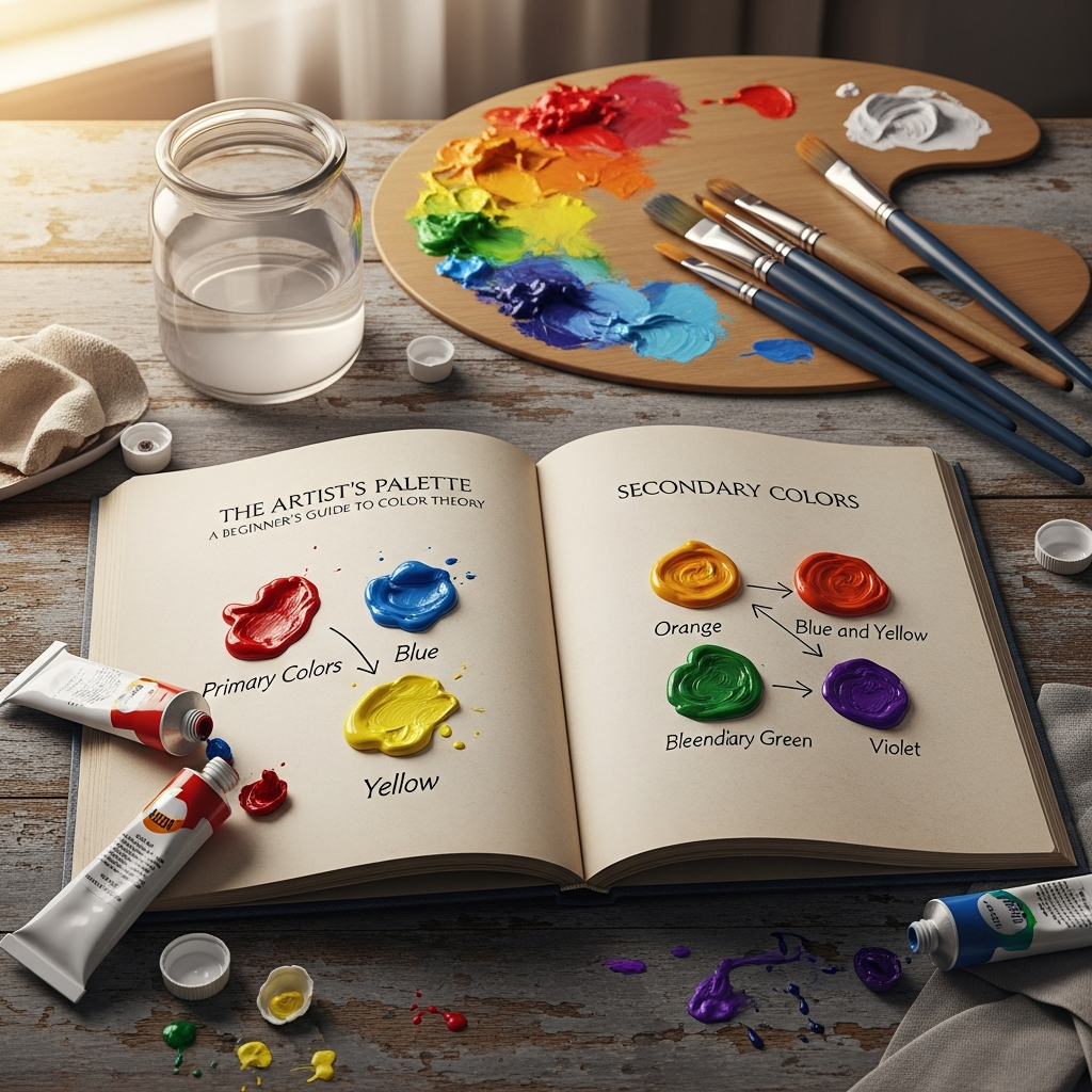
Primary colors are the foundational hues from which all other colors are derived. In traditional art, often referred to as the RYB (Red, Yellow, Blue) model, these are red, yellow, and blue. You simply cannot create these colors by mixing any other pigments together. They are the absolute starting point, the bedrock of the entire color system. Imagine these three as the original parents of all other colors in your palette.
These fundamental colors hold significant weight in both theory and practice. For painters, starting with high-quality primary red, yellow, and blue pigments, along with white and black, means they can mix nearly every other color they need, saving money and offering immense creative control. This concept is crucial for any Primary And Secondary Colors In Art Guide For Beginners, as it empowers artists to see beyond pre-mixed tubes and into a world of limitless color possibilities.
Historically, the understanding of primary colors has evolved. While artists have used pigments for millennia, the scientific understanding began to solidify with figures like Sir Isaac Newton in the 17th century. Newton’s experiments with light, and later Goethe’s focus on perception, laid much of the groundwork for modern color theory, establishing red, yellow, and blue as key primary colors in the subtractive (pigment) model.
The Three Essential Primary Colors
In the context of pigments and traditional art, the three primary colors are:
- Red: A warm, energetic color often associated with passion, energy, and urgency. It can grab attention and create a sense of excitement.
- Yellow: A bright, cheerful color linked with happiness, optimism, and warmth. It can lift moods and make designs feel friendly.
- Blue: A cool, calming color that often represents trust, stability, and serenity. It is widely liked and can create a sense of professionalism.
These colors are not just visual; they carry psychological weight that artists leverage to evoke specific emotions and guide the viewer’s eye. For instance, a dominant red in a painting might communicate intensity or love, while a soothing blue could suggest peace or sadness. Understanding these inherent emotional connections is an integral part of any comprehensive Primary And Secondary Colors In Art Guide For Beginners.
Additive vs. Subtractive Color Models
It’s important for beginners to note that while we focus on the RYB (Red, Yellow, Blue) model for physical pigments, there are other primary color systems. The RGB (Red, Green, Blue) model is an additive color system, primarily used for light, such as on computer screens, televisions, and theatrical lighting. In this model, mixing red, green, and blue light creates white light. When mixing paints, however, we use the subtractive model, where mixing primaries absorbs light, leading to darker colors. This distinction is crucial to avoid confusion when encountering different discussions about “primary colors” in various contexts, from digital art to traditional painting. This guide primarily focuses on the subtractive RYB model as it applies to art with physical mediums.
The Next Level: What are Secondary Colors?
Secondary colors are the next step in your color mixing journey. They are created by combining two primary colors in equal proportions. Think of them as the direct offspring of the primary colors, sitting right between their parent hues on a color wheel. Mastering the mixing of secondary colors is a core element of any effective Primary And Secondary Colors In Art Guide For Beginners. It unlocks a wider spectrum of possibilities beyond the initial three.
When you mix two primary colors, the result is a brand new, vibrant hue. This simple act of blending pigments is where the magic of color mixing truly begins for many artists. It shows you how these basic colors interact and how you can expand your palette significantly with just a few tubes of paint. The process is both scientific and intuitive, encouraging experimentation to find just the right shade.
The importance of secondary colors extends beyond mere mixing. They offer a balance between the vibrancy of primary colors and the complexity of tertiary colors, providing a richer vocabulary for artistic expression. Designers, for example, often use secondary colors as accents to support primary brand colors, adding depth and emotional balance without overpowering the main message.
The Three Classic Secondary Colors
Based on the traditional RYB primary colors, the three secondary colors are:
- Orange: Created by mixing Red and Yellow. Orange blends the energy of red with the happiness of yellow, often signifying enthusiasm, creativity, and warmth.
- Green: Created by mixing Blue and Yellow. Green is strongly associated with nature, growth, and tranquility. It can also symbolize freshness and balance.
- Purple (or Violet): Created by mixing Red and Blue. Purple often conveys luxury, royalty, creativity, and spirituality. It can be deeply mysterious or elegantly sophisticated.
These secondary colors each possess their own unique psychological impact, just like the primaries. Green might create a calming effect in a landscape, while orange could add a burst of playful energy to a still life. Understanding these nuances is a key part of developing a strong artistic voice through color. For any Primary And Secondary Colors In Art Guide For Beginners, knowing these combinations by heart is the first step to confident mixing.
The Indispensable Tool: The Color Wheel
At the very heart of understanding primary and secondary colors in art lies the color wheel. This circular diagram is an illustrative tool that visually organizes colors and shows their relationships to one another. It was first invented by Sir Isaac Newton in 1666, demonstrating how colors relate and interact. The color wheel is not just a theoretical concept; it’s a practical guide that artists, designers, and anyone working with color uses daily to mix paints, choose color schemes, and understand why certain colors work well together.
The color wheel helps simplify complex color relationships, making it accessible for beginners. It’s a fundamental visual aid that breaks down the spectrum into easily digestible categories, allowing you to see at a glance how various hues are created and how they interact. Without this tool, navigating the vast world of color would be far more challenging and less intuitive.
Making your own color wheel with your chosen paints is a highly recommended exercise for any beginner. This hands-on experience solidifies your understanding of how primary colors combine to form secondary colors, and how these, in turn, lead to tertiary colors. It transforms abstract theory into tangible, repeatable results, building muscle memory for mixing.
Structure of the Color Wheel
The basic color wheel for pigments is typically structured as follows:
- Primary Colors: Red, Yellow, and Blue are placed equidistant around the wheel. These are the three fundamental colors that cannot be created by mixing other colors.
- Secondary Colors: Orange, Green, and Purple are placed between the two primary colors that create them.
- Orange sits between Red and Yellow.
- Green sits between Yellow and Blue.
- Purple (Violet) sits between Blue and Red.
- Tertiary Colors: These are created by mixing a primary color with an adjacent secondary color. They typically have two-word names, combining the names of their parent primary and secondary colors (e.g., Red-Orange, Yellow-Green, Blue-Violet). There are six tertiary colors.
This arrangement provides a clear map of color relationships, allowing artists to identify complementary, analogous, and triadic color schemes with ease. For a Primary And Secondary Colors In Art Guide For Beginners, understanding the color wheel’s structure is paramount for confident color selection and mixing.
Expanding Your Palette: Tertiary Colors
Once you’ve mastered primary and secondary colors in art, the next natural step is to explore tertiary colors. These colors are formed by mixing a primary color with a secondary color that is next to it on the color wheel. Tertiary colors bridge the gaps between primaries and secondaries, offering a more nuanced and complex spectrum of shades. They add sophistication and depth to your palette, moving beyond basic vibrant hues into richer, more subtle tones.
The creation of tertiary colors significantly expands an artist’s expressive range. They allow for smoother transitions, more intricate color schemes, and the ability to capture a wider array of real-world colors, from the burnt orange of autumn leaves to the teal blue of tropical waters. These shades are often what give artworks a more refined and natural appearance.
For beginners, understanding tertiary colors means gaining a finer control over color mixing. It moves you from simply knowing “red and yellow make orange” to understanding how different ratios and neighboring colors can create a vast array of unique hues like “red-orange” or “yellow-orange.” This level of detail is critical for developing a truly diverse and personal artistic palette.
The Six Tertiary Colors
The six tertiary colors, derived from mixing a primary with an adjacent secondary, are:
- Red-Orange: Red (Primary) + Orange (Secondary)
- Yellow-Orange: Yellow (Primary) + Orange (Secondary)
- Yellow-Green: Yellow (Primary) + Green (Secondary)
- Blue-Green (or Teal/Aqua): Blue (Primary) + Green (Secondary)
- Blue-Purple (or Indigo/Violet): Blue (Primary) + Purple (Secondary)
- Red-Purple (or Magenta/Crimson): Red (Primary) + Purple (Secondary)
It’s important to remember that the specific shade of a tertiary color will depend on the exact primary and secondary colors used, as well as their proportions. Experimentation is key to discovering the full range of these beautiful intermediate colors. This detailed breakdown is vital for any comprehensive Primary And Secondary Colors In Art Guide For Beginners.
Beyond the Basics: Color Harmonies and Schemes
Simply knowing your primary and secondary colors in art is a fantastic start, but truly mastering color involves understanding how they work together in harmonious relationships. Color harmonies are combinations of colors that are visually pleasing and create a sense of balance and unity in an artwork. They are powerful tools that artists use to evoke specific moods, create contrast, or ensure their compositions feel cohesive and intentional.
Exploring different color schemes will allow you to move beyond simply mixing individual colors and into orchestrating entire palettes that resonate with your artistic vision. This understanding is what separates competent use of color from truly impactful and expressive color choices. It helps you design visuals that not only look good but also communicate effectively.
The color wheel is your best friend when it comes to identifying these harmonies. By observing the positions of colors on the wheel, you can quickly determine which combinations will create the desired effect, whether it’s a bold statement or a subtle, calming atmosphere. This knowledge empowers you to make deliberate choices rather than relying on guesswork.
Key Color Schemes for Beginners
Here are some fundamental color schemes derived from the color wheel:
- Complementary Colors: These are colors located directly opposite each other on the color wheel (e.g., Red and Green, Blue and Orange, Yellow and Purple).
- Impact: They create a strong contrast and high visual impact, making each other appear brighter and more vivid when placed side-by-side. This dynamic tension can draw attention and create energy.
- Application: Often used when you want elements to stand out, like in branding, calls-to-action, or to create a focal point in a painting. For instance, a bright orange button against a blue background will pop.
- Analogous Colors: These are three or more colors that are next to each other on the color wheel (e.g., Blue, Blue-Green, Green).
- Impact: They create a harmonious, serene, and comfortable feel because they share a common hue and blend smoothly. This scheme is often found in nature.
- Application: Ideal for creating calm and cohesive designs or paintings where you want a unified look. Impressionist artists famously used analogous color combinations to create harmonious works.
- Triadic Colors: These are three colors that are evenly spaced around the color wheel (e.g., Red, Yellow, Blue — the primary colors themselves; or Orange, Green, Purple — the secondary colors).
- Impact: They offer a vibrant and balanced aesthetic, even when using less saturated versions. This scheme provides a good level of contrast without being overwhelming.
- Application: Can be used to create energetic and lively compositions, but it’s important to balance the colors so one is dominant and the others act as accents.
Understanding these schemes is crucial for any Primary And Secondary Colors In Art Guide For Beginners because it empowers you to make deliberate and effective color choices that elevate your artwork.
The Psychological Power of Color
Colors are not merely visual phenomena; they are deeply intertwined with human psychology, capable of evoking a wide range of emotions, influencing perceptions, and even affecting behavior. This psychological impact of color is a powerful tool for artists to communicate messages, set moods, and connect with viewers on an emotional level. Integrating this understanding is a vital component of a comprehensive Primary And Secondary Colors In Art Guide For Beginners.
From ancient civilizations to modern marketing, humanity has recognized and utilized the emotional resonance of different hues. While some associations can be cultural or personal, there are widely recognized psychological effects that artists can intentionally leverage in their work. For example, a restaurant might use warm colors to stimulate appetite, while a tech company might choose cool blues to convey trust.
As an artist, being aware of these associations allows you to make more thoughtful and impactful color choices. It helps you consider not just how a color looks, but how it feels and what message it silently conveys to your audience. This adds another layer of depth and intention to your creative process.
Emotional Associations of Primary Colors
- Red: Frequently associated with passion, love, energy, anger, and urgency. It’s a highly stimulating color that can evoke strong feelings, from intense affection to warning signs.
- Yellow: Often linked to happiness, optimism, warmth, and cheerfulness. Yellow can uplift spirits and create a friendly, approachable atmosphere. However, it can also subtly suggest caution.
- Blue: Commonly conveys trust, calmness, stability, serenity, and professionalism. Blue is widely regarded as a calming color and can also express sadness or distance.
Emotional Associations of Secondary Colors
- Orange: A mix of red’s energy and yellow’s happiness, orange symbolizes enthusiasm, creativity, adventure, and warmth. It’s often seen as playful and friendly.
- Green: Deeply connected to nature, growth, health, balance, and tranquility. Green offers a refreshing and harmonious feel, though it can also, less commonly, evoke envy.
- Purple: Represents luxury, royalty, creativity, wisdom, and spirituality. Purple can feel sophisticated and mysterious, combining the stability of blue with the energy of red.
Understanding these psychological connections is a profound aspect of mastering color, turning your knowledge of Primary And Secondary Colors In Art Guide For Beginners into a tool for emotional storytelling.
Warm and Cool Colors: Setting the Mood
Another critical aspect of color theory for artists, especially beginners, is understanding the concept of warm and cool colors. The color wheel can be divided into two halves: warm and cool colors, each capable of evoking distinct moods and creating different visual effects within a composition. This distinction allows artists to manipulate the emotional temperature of their work and influence spatial perception.
Warm colors tend to advance in a painting, drawing the viewer’s eye forward, while cool colors often recede, creating a sense of distance or depth. This visual phenomenon is incredibly useful for creating focal points or suggesting atmosphere in your art. A deep understanding of these temperatures is a vital part of a complete Primary And Secondary Colors In Art Guide For Beginners.
The psychological associations with warm and cool colors are also quite strong. Warm colors are often associated with things like the sun and fire, while cool colors bring to mind water, ice, and sky. These natural associations contribute to the feelings they evoke in us.
Identifying Warm Colors
Warm colors typically include:
- Reds
- Oranges
- Yellows
These hues are generally perceived as energetic, cheerful, and cozy. Artists often use warm colors to:
- Create a sense of closeness or intimacy.
- Draw attention to a focal point.
- Convey feelings of excitement, passion, or happiness.
- Portray light sources like sunlight or fire.
Consider a painting by Pierre-Auguste Renoir, where warm yellows, oranges, and pinks create a cheerful and inviting scene, illustrating the power of warm tones to evoke joy.
Identifying Cool Colors
Cool colors typically include:
- Blues
- Greens
- Purples (Violets)
These colors are generally perceived as calming, soothing, and sometimes melancholic or distant. Artists often use cool colors to:
- Create a sense of space or distance, making objects appear to recede.
- Convey feelings of tranquility, peace, or sadness.
- Suggest shadows or nighttime scenes.
In contrast to Renoir, an artist like David Alfaro Siqueiros might use cool blues and greens to depict a somber, cold scene, demonstrating how these colors can effectively convey a sense of melancholy.
The Relativity of Color Temperature
It is fascinating to note that the warmth or coolness of a color can also be relative, depending on the colors it is placed next to. For instance, a red-violet might appear cooler next to a pure red but warmer next to a blue. Understanding this “color bias” allows for even more sophisticated color manipulation, enabling artists to create subtle shifts in temperature within a single hue. This nuanced perception is a subtle yet powerful aspect for any artist working with Primary And Secondary Colors In Art Guide For Beginners.
Practical Application: Mixing and Using Colors Effectively
Understanding the theory behind primary and secondary colors in art is one thing, but applying that knowledge practically is where the real fun begins. Effective color mixing and usage are skills honed through practice and experimentation. For beginners, translating theoretical concepts into tangible results on canvas can be daunting, but with a few practical tips, you can approach your palette with confidence.
The goal isn’t just to mix the “right” color, but to mix the desired color – one that serves your artistic intention. This involves not only understanding color relationships but also developing an intuitive feel for how different pigments behave. Every tube of paint has its own unique characteristics, and getting to know them through hands-on experience is invaluable.
Think of your palette as a laboratory, and yourself as a mad scientist. Don’t be afraid to try combinations, make mistakes, and discover unexpected beautiful shades. This iterative process of mixing, observing, and adjusting is fundamental to truly mastering color. This practical guidance is what makes a Primary And Secondary Colors In Art Guide For Beginners truly useful.
Tips for Successful Color Mixing
- Start with Pure Pigments: For the most vibrant and clean secondary and tertiary colors, begin with pure, unmixed primary pigments. Contaminated primaries can lead to muddy results.
- Experiment with Proportions: Varying the amount of each primary color will produce different shades of the secondary color. For example, more yellow in a red-yellow mix will give you a yellow-orange, while more red will lean towards a red-orange.
- Mix Small Amounts First: Especially when starting, mix small quantities of paint. This prevents waste and allows you to adjust the hue more easily.
- Create a Mixing Card/Chart: Keep a small piece of paper or a dedicated mixing card to test your blends and label them. This serves as a visual reference for future projects and helps you remember your favorite hues.
- Add Dark to Light: When trying to lighten a color, it’s generally easier to add a small amount of the darker color to a larger amount of the lighter color, rather than the other way around. This saves paint and gives you more control.
- Consider Color Bias: Even within “red,” “yellow,” or “blue,” pigments can lean slightly towards another color (e.g., a “blue-red” vs. an “orange-red”). Understanding these subtle biases can help you mix brighter or duller secondary colors. For a bright green, use a yellow with a green bias and a blue with a green bias; for a duller green, use primaries with a red bias, as red is green’s complement and will neutralize it.
- Don’t Overmix: Sometimes, a slightly imperfect mix can add interesting texture and life to your colors. Overmixing can sometimes lead to dullness.
- Understand Value and Saturation:
- Value is the lightness or darkness of a color. Adding white creates a tint (lighter), and adding black creates a shade (darker). Adjusting value creates depth.
- Saturation is the intensity or purity of a color. A highly saturated color is vivid; a less saturated color is more muted. Mixing a color with its complementary can de-saturate it.
Using Colors for Impact
- Focal Points: Use warm, bright, or highly contrasting colors to draw the viewer’s eye to specific areas of your artwork.
- Mood and Atmosphere: Leverage the psychological effects of colors to set the overall tone. Cool colors for a peaceful scene, warm colors for an energetic one.
- Depth and Dimension: Use warm colors to bring elements forward and cool colors to push them back. Varying values (lights and darks) also creates a sense of three-dimensionality.
- Branding and Messaging: In design, primary and secondary colors establish identity and guide user attention. For example, secondary colors are excellent for accentuating elements like call-to-action buttons or important information.
These practical applications are the bridge between knowing your Primary And Secondary Colors In Art Guide For Beginners and truly bringing your artistic visions to life.
The Evolution of Color Theory in Art
The understanding and application of color in art has a rich and fascinating history, evolving significantly over centuries. From ancient civilizations using limited palettes to modern artists pushing the boundaries of chromatic expression, the journey of color theory is a testament to humanity’s enduring fascination with visual perception. This historical context enriches any Primary And Secondary Colors In Art Guide For Beginners, providing a deeper appreciation for the foundations we build upon today.
Long before scientific theories, color held symbolic and often spiritual significance. Ancient Egyptians, for example, utilized a palette of six colors, each imbued with specific meanings. The cost and rarity of certain pigments also heavily influenced their use, with expensive blues being highly prized in the Middle Ages. This early, intuitive approach to color laid the groundwork for later, more systematic studies.
The ongoing exploration of color continues to inspire artists and designers, demonstrating that while the basics remain constant, the ways in which we perceive and employ color are ever-expanding. Each era brings new insights and approaches, making color a truly dynamic element of artistic practice.
Key Milestones in Color Theory
- Ancient Philosophers (Aristotle, 300 BCE): Early theories proposed by figures like Aristotle suggested that colors were sent by God and originated from combinations of light and darkness. These beliefs were influential for nearly two millennia.
- Sir Isaac Newton (17th Century): A pivotal shift occurred with Newton’s scientific experiments. He demonstrated that white light could be split into a spectrum of colors using a prism and, crucially, invented the first color wheel, organizing colors based on scientific observation. His work established red, yellow, and blue (in the subtractive model for pigments) as key primary colors.
- Johann Wolfgang von Goethe (Early 19th Century): Goethe, a German poet and artist, challenged Newton’s purely scientific view, developing a color theory focused more on human perception and the psychological effects of color. His “Theory of Colors” explored how colors influence emotions and our subjective experience, bridging the gap between scientific fact and human feeling.
- Impressionism and Beyond: Artists of the Impressionist movement, influenced by figures like Chevreul (who studied color contrast), focused on capturing the essence of light and color as they appeared in nature. They famously used analogous colors to create harmonious paintings. Later movements, from Fauvism to Bauhaus, continued to explore color’s expressive potential, pushing boundaries and developing new methodologies for its application.
- Modern Applications: Today, color theory extends into digital design, branding, and user interface (UI) development. Designers apply principles of Primary And Secondary Colors In Art Guide For Beginners to create accessible, aesthetically pleasing, and emotionally resonant digital experiences. The understanding of warm and cool colors, complementary schemes, and psychological impact is just as relevant in a digital canvas as on a physical one.
This rich history demonstrates that while the core concepts of primary and secondary colors in art remain constant, their interpretation and application are continually evolving. Artists today stand on the shoulders of giants, equipped with centuries of knowledge to inform their creative choices.
Conclusion: Your Colorful Journey Begins
Embarking on the artistic path, especially when it comes to color, is a journey of endless discovery and joy. This comprehensive Primary And Secondary Colors In Art Guide For Beginners has laid out the fundamental building blocks of color theory, from the foundational primaries to the versatile secondaries, and beyond to tertiary colors and harmonious schemes. Understanding these concepts is not just about memorizing facts; it’s about unlocking a deeper intuition for how colors interact, how they speak to us emotionally, and how they can transform a blank canvas into a compelling narrative.
Remember the pure, unmixable power of Red, Yellow, and Blue as your primary colors. These are the starting points, the genesis of all other hues. Then, embrace the creative alchemy of mixing these primaries to create your dynamic secondary colors: Orange, Green, and Purple. These six core colors form the backbone of your artistic palette, offering a vast array of expressive possibilities.
The color wheel remains your most trusted companion, a visual map to navigate complex relationships and unlock harmonious combinations. Experiment with complementary pairings for striking contrast or analogous schemes for serene unity. Beyond the technical aspects, always consider the profound psychological impact of each hue; how warm reds ignite passion, cool blues soothe the soul, and vibrant greens evoke nature’s embrace.
Your journey as an artist is deeply personal, and mastering primary and secondary colors in art is a continuous process of observation, practice, and fearless experimentation. Don’t be afraid to mix, to make mistakes, and to discover unique shades that speak to your individual vision. With this guide, you now possess the essential knowledge to approach color with confidence, allowing your creativity to flourish in a world full of magnificent hues. Grab your paints, embrace the rainbow, and let your artistic story unfold in vivid color.
FAQ (Pertanyaan yang Sering Diajukan)
Q: What are the three primary colors in art?
A: In traditional art and for physical pigments, the three primary colors are Red, Yellow, and Blue. These colors cannot be created by mixing any other colors together.
Q: How are secondary colors made?
A: Secondary colors are created by mixing two primary colors in equal proportions. For instance, red and yellow make orange, yellow and blue make green, and red and blue make purple.
Q: What are the main secondary colors?
A: The three main secondary colors are Orange, Green, and Purple (or Violet).
Q: What is the purpose of a color wheel for beginners?
A: The color wheel is a visual tool that organizes colors and shows their relationships. For beginners, it helps understand how colors mix, identify primary, secondary, and tertiary colors, and create harmonious color schemes like complementary or analogous palettes.
Q: What is the difference between warm and cool colors?
A: Warm colors (reds, oranges, yellows) are associated with energy, heat, and tend to advance in a composition, drawing attention. Cool colors (blues, greens, purples) are associated with calmness, water, and tend to recede, creating depth.
Q: Why is understanding primary and secondary colors important for artists?
A: Understanding primary and secondary colors is crucial because it forms the foundation of all color mixing. It allows artists to create a vast range of hues from a limited palette, choose effective color schemes, and leverage the psychological impact of colors to evoke specific moods and messages in their artwork.