15+ Minimalist Magazine Layout Inspiration Ideas to Master Clean Editorial Design
In an era of information overload, the “less is more” philosophy has become a sanctuary for readers. Minimalist magazine layout inspiration is not merely about having fewer elements on a page; it is about the strategic use of space to enhance readability and aesthetic value. When you strip away the clutter, you allow the core message and the visual art to breathe.
Whether you are designing a high-end fashion quarterly, a niche lifestyle journal, or a digital corporate brochure, understanding the nuances of minimalist editorial design is essential. This guide provides a deep dive into the principles, inspirations, and technical steps required to create world-class layouts that resonate with modern audiences.
The Core Philosophy of Minimalism in Print and Digital Media
Minimalism in magazine design is deeply rooted in the Swiss Design (International Typographic Style) of the 1950s. It prioritizes cleanliness, readability, and objectivity. By using a minimalist aesthetic, you are making a conscious choice to prioritize the user experience over decorative excess.
For you as a designer or a brand owner, this means focusing on the visual hierarchy. You must guide the reader’s eye through the page using intentional placements rather than flashy graphics. The goal is to create a sense of calm and sophistication that keeps the reader engaged without feeling overwhelmed.
1. The Power of “Active” Whitespace
One of the most critical elements of minimalist magazine layout inspiration is the use of whitespace, often referred to as negative space. In minimalist design, whitespace is not “empty” space; it is a functional tool used to group elements or separate ideas.
- Macro Whitespace: The large areas between major layout elements (like the space between a headline and a body paragraph).
- Micro Whitespace: The small gaps between letters (kerning), lines (leading), and words.
By increasing your margins and giving your images plenty of room, you elevate the perceived value of the content. High-end brands often use expansive whitespace to signal luxury and exclusivity.
2. Mastering the Grid System
Behind every successful clean magazine layout lies a rigid, yet flexible, grid system. Grids provide the skeletal structure that ensures consistency across different pages. For a minimalist look, consider using a 12-column grid but only occupying a few columns for text, leaving the rest for breathing room.
Asymmetric grids are particularly popular in modern minimalist design. They create visual interest and movement without needing extra decorative elements. By placing text off-center, you create a dynamic tension that captures attention immediately.
3. Typography as the Primary Visual Element
In minimalist design, your font choice does the heavy lifting. You don’t need illustrations when your typography is beautiful. When seeking typography inspiration, look for high-contrast pairings:
- Serif for Elegance: Use classic serifs like Didot or Bodoni for headlines to evoke a sense of tradition and fashion.
- Sans-Serif for Modernity: Use clean sans-serifs like Helvetica, Montserrat, or Futura for body text to ensure maximum legibility.
Bold typography can also serve as the main graphic element. A single, oversized word on a page can be more impactful than a complex collage of images.
4. The “Single Point of Focus” Layout
A common mistake in magazine design is trying to highlight everything at once. Minimalist inspiration suggests picking one hero element. This could be a stunning full-bleed photograph, a provocative quote, or a bold numerical data point.
When you provide a single point of focus, you respect the reader’s time and attention. This approach is highly effective for feature spreads where the imagery needs to tell a story on its own.
5. Minimalist Cover Design Ideas
The cover is the most important page of your magazine. A minimalist magazine cover usually features:
- A single, high-quality image with a clear focal point.
- A limited color palette (often monochromatic or muted tones).
- Masterful use of the masthead (sometimes partially hidden behind the subject for depth).
- Minimal “sell lines” or cover stories listed, often using only one or two primary headlines.
6. Table of Contents: Clarity Over Complexity
Your Table of Contents (TOC) should be a roadmap, not a maze. Use minimalist editorial design to categorize sections clearly. Use plenty of space between page numbers and titles. Consider using a simple vertical list with a lot of padding, or a small thumbnail image for only the “must-read” feature stories.
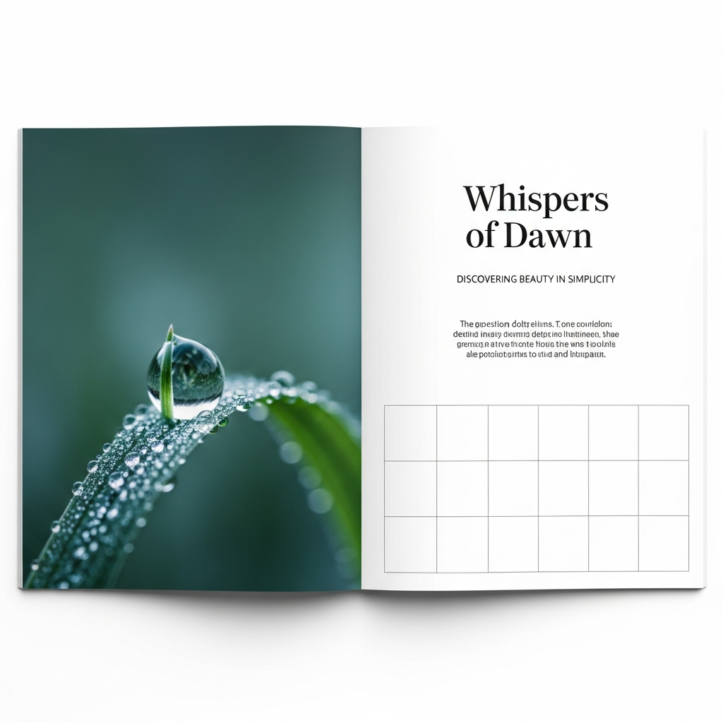
7. The Photographic Essay Spread
For magazines focused on travel, architecture, or art, the photographic essay is a staple. To keep it minimalist:
- Use consistent borders around images to create a gallery-like feel.
- Avoid overlapping photos; let each image stand on its own.
- Use small, discreet captions in a light font weight so they don’t distract from the visual.
8. Minimalist Interview Layouts
Interviews can often look “busy” due to the Q&A format. To maintain a clean layout, use distinctive typographic styles to differentiate the interviewer from the subject. For example, use Bold Sans-Serif for questions and Light Italic Serif for answers. Incorporating large pull-quotes in the center of the page can also break up long blocks of text elegantly.
9. Monochromatic Color Schemes
Color is a powerful tool, but in minimalism, it is used sparingly. A monochromatic palette—using various shades of a single color—creates a cohesive and sophisticated look. Alternatively, using a “pop” of a single vibrant color (like neon orange or deep cobalt) against a black-and-white layout can create a stunning visual anchor.
10. Breaking the Grid (Intentionally)
Once you have mastered the grid, the next step in minimalist magazine layout inspiration is learning how to break it. A slight overlap of an image over a text block or a headline that runs off the edge of the page can add a contemporary, “artsy” feel while still maintaining a clean aesthetic.
How to Create a Minimalist Layout: A Step-by-Step Guide
Designing a minimalist layout requires discipline. Follow these steps to achieve a professional result:
Step 1: Define Your Visual Hierarchy
Before opening your design software, decide what the most important element on the page is. Is it the headline? The image? The quote? Everything else must be secondary to this focal point.
Step 2: Set Up a Robust Grid
Use software like Adobe InDesign or Affinity Publisher. Set up a baseline grid to ensure your lines of text align perfectly across columns. This “invisible” alignment is what makes minimalist designs feel “right” to the eye.
Step 3: Choose Two Typefaces Max
Select one serif and one sans-serif. Use different weights (Bold, Regular, Light) to create variety rather than adding more font families. This maintains visual consistency.
Step 4: Audit Your Content
Look at your page and ask: “What can I remove?” If a decorative line, a background texture, or an extra image doesn’t add meaning to the story, delete it. Negative space is your friend.
Step 5: Focus on Alignment
In minimalist design, misalignments are glaringly obvious. Ensure every element is snapped to your grid. Use “Flush Left” (Left Aligned) text for a modern look, as justified text can create awkward gaps (rivers) that disrupt the clean aesthetic.
Top Tools for Designing Minimalist Magazines
To execute these minimalist layout ideas, you need the right tools:
- Adobe InDesign: The industry standard for editorial design. Its grid and typography tools are unmatched.
- Affinity Publisher: A cost-effective, professional alternative to InDesign with a very smooth workflow.
- Canva: Great for beginners or digital-only magazines, offering many minimalist templates to start with.
- Figma: Increasingly used for digital magazine layouts and interactive editorial content.
Common Mistakes to Avoid in Minimalist Design
Even though it looks simple, minimalism is easy to get wrong. Avoid these pitfalls:
- Being Too “Boring”: Minimalism isn’t just a blank page. You still need contrast and visual interest.
- Ignoring Legibility: Don’t make your font so small or light that people can’t read it just to look “cool.”
- Inconsistent Spacing: If your margin is 50px on one page, it shouldn’t be 30px on the next.
- Poor Image Quality: In a minimalist layout, images are under a microscope. Use only high-resolution, professionally shot photography.
The Future of Minimalist Magazine Design
As we move further into the digital age, minimalist magazine layout inspiration is evolving. We are seeing more “brutalist” minimalism—which uses raw, unpolished elements with massive whitespace. Interactive digital magazines are also using “scrollytelling,” where elements fade in and out, maintaining a clean interface while providing a rich narrative experience.
Minimalism is not a trend; it is a timeless approach to communication. By focusing on the essentials, you create a design that is both functional and beautiful, ensuring your content remains the star of the show.
Conclusion
Mastering minimalist magazine layout inspiration requires a shift in mindset. You must value the space between elements as much as the elements themselves. By utilizing strong grids, intentional typography, and high-quality imagery, you can create a magazine that feels modern, expensive, and incredibly readable.
Remember, your goal is to remove the friction between the reader and the content. Start experimenting with these ideas today, and watch how a cleaner approach transforms your editorial projects.
Frequently Asked Questions (FAQ)
Q: What is the best font for a minimalist magazine?
A: There is no single “best” font, but classics like Helvetica, Futura, and Gill Sans for sans-serif, or Playfair Display and Caslon for serif, are excellent choices for a minimalist aesthetic.
Q: How much whitespace should I use?
A: A good rule of thumb for minimalism is to have at least 30-40% of your page as whitespace. However, this varies based on the “mood” you want to create.
Q: Can I use color in minimalist design?
A: Absolutely. Minimalism is not just black and white. You can use color, but it should be used purposefully—to highlight an element or create a specific emotional tone—rather than just for decoration.
Q: Is minimalist design suitable for all types of magazines?
A: While it works best for lifestyle, art, fashion, and architecture, any magazine can benefit from minimalist principles to improve clarity and professional appeal.