The pastel aesthetic has dominated visual media for years, transcending transient fads to become a timeless staple in photography. It is characterized by colors that are light, soft, and desaturated, evoking feelings of calm, nostalgia, and dreaminess. Unlike vibrant, highly saturated images that are often bold and energetic, the pastel look is gentle and airy. To truly understand How to Create Pastel Tones in Lightroom, you must first grasp the color theory behind this beautiful style.

Pastel colors are essentially any color mixed with a large amount of white, increasing its brightness and decreasing its saturation, a process technically known as tinting. Think of shades like mint green, baby blue, dusty rose, and lavender. These colors thrive in environments with soft light and minimal harsh shadows. Successfully applying this look means transforming the image’s overall contrast and color intensity to match this softer mood.
The foundation of the pastel aesthetic is not just in the colors themselves, but in the tonality of the image. The image needs a low-contrast, ‘matte’ appearance. This is where the magic of digital editing begins, as we seek to lift the darkest points (blacks) and slightly pull back the brightest points (whites) to avoid harshness. This specific manipulation of the light and dark areas is critical because it gives the photograph that signature faded, ethereal quality often associated with vintage prints or film stock. Without this tonal adjustment, the colors you apply, no matter how soft, will not fully achieve the desired pastel look.
Furthermore, a significant trend in 2024 is the evolution of pastels; they are no longer restricted to pure soft hues but are sometimes combined with a touch of vibrancy, resulting in “Vibrant pastel presets” that maintain the softness but carry a more noticeable punch. This nuance is important: the goal is not flat colorlessness, but rather a soft, nuanced palette. If you are serious about mastering How to Create Pastel Tones in Lightroom, understanding this balance between softness and subtle color presence is non-negotiable. It allows the final image to feel modern and relevant while maintaining the classic dreamy appeal.
The Essential Tools for Mastering Pastel Color Grading
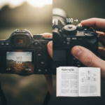
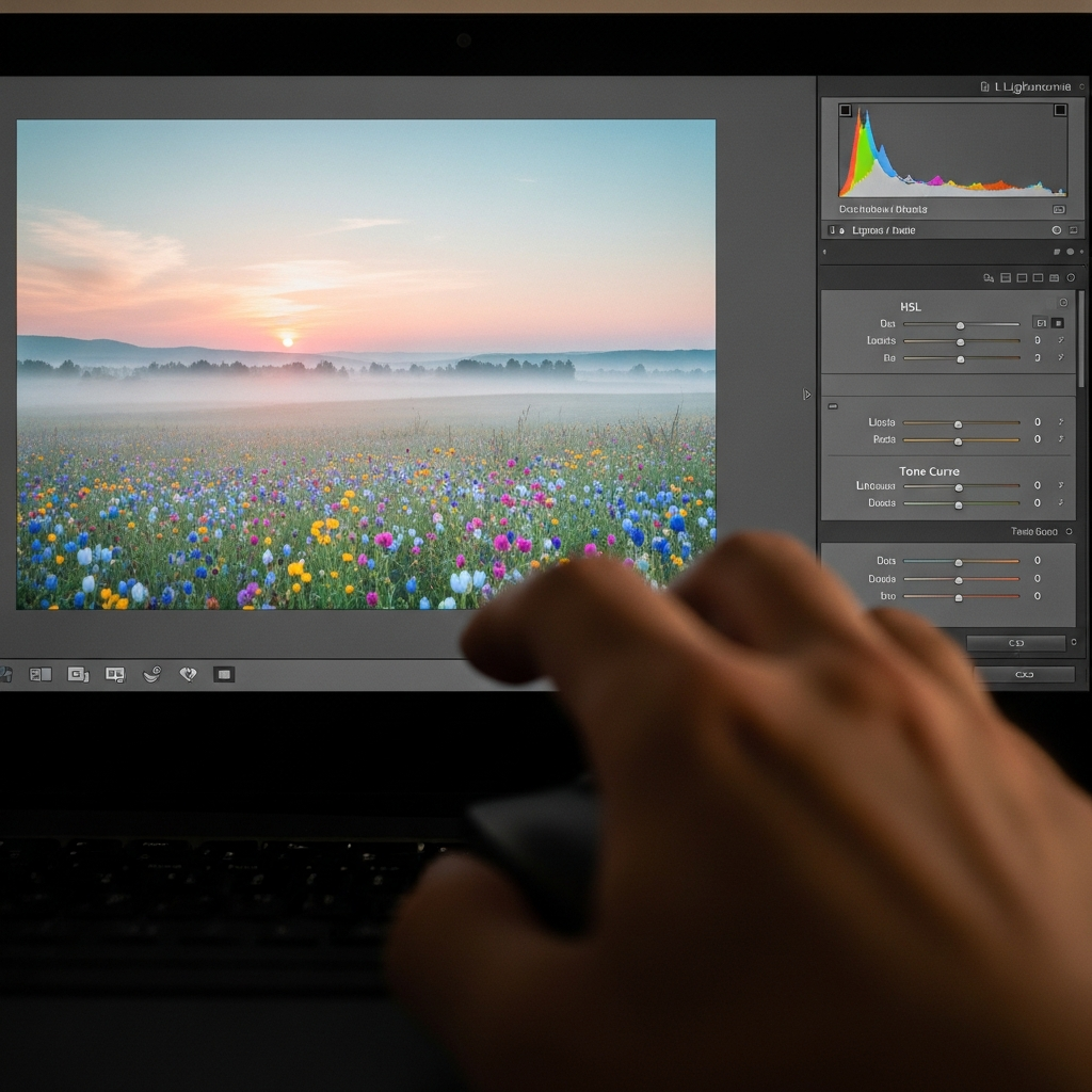
To successfully learn How to Create Pastel Tones in Lightroom, you need to be intimately familiar with the software’s core development panels. Achieving this specific look is less about applying a single slider and more about a precise, multi-step process utilizing several tools in a coordinated manner. The power of this editing suite lies in its non-destructive approach, allowing for detailed, reversible adjustments.
Featured Snippet Optimization: The Core Steps
The process of creating the distinct pastel aesthetic relies on three primary adjustments within the Develop Module. These steps fundamentally change the light, contrast, and color information of your photograph. Mastering these is the fastest way to understand How to Create Pastel Tones in Lightroom.
| Lightroom Panel | Function in Pastel Editing | Key Result |
| :— | :— | :— |
| Tone Curve | Lifting the black point to create a matte, faded look. | Low-Contrast Tonal Base |
| HSL Panel | Selectively reducing saturation and increasing luminance for specific colors. | Desaturated, Tinted Hues |
| Color Grading | Adding specific subtle color shifts (tints) to the shadows and highlights. | Final Color Harmony/Split Tones |
This combination is far more effective than simply pulling down the general Saturation slider, which often results in a dull, lifeless photo. Instead, we use targeted tools to maintain depth while introducing the characteristic soft glow. If you are learning How to Create Pastel Tones in Lightroom, you must approach it systematically, starting with the tone before moving to the color.
The Basic Panel: Laying the Groundwork
Before diving into the complex color tools, the Basic panel is where you set the initial exposure and contrast, which is crucial for the pastel effect. Pastel images generally require a higher exposure and a softer contrast. You should slightly increase the overall exposure to brighten the image, giving it an airy feel. Then, immediately address the contrast.
For optimal results in your quest to know How to Create Pastel Tones in Lightroom, you should:
- Contrast: Decrease this slider significantly (e.g., -20 to -50). This immediately softens the image and prepares it for the matte look we will achieve with the Tone Curve.
- Highlights & Whites: Pull these back (negative numbers, e.g., -50 to -100). This protects the brightest parts of the image from blowing out, which is common in high-key pastel photos.
- Shadows & Blacks: Increase these (positive numbers, e.g., +40 to +100). By lifting the shadows, you reveal detail in the darker areas and further reduce overall image contrast, contributing heavily to the soft, faded aesthetic.
Interestingly, some methods suggest a small reduction in the Dehaze slider, which introduces a subtle, low-level atmospheric fog, further softening the photograph. While not always necessary, it is an advanced subtlety in knowing How to Create Pastel Tones in Lightroom. The adjustments here set the stage; they ensure your image is light and flat before you begin adding the signature pastel colors.
Step-by-Step Guide: How to Create Pastel Tones in Lightroom
Mastering the precise combination of tools is what distinguishes a beginner edit from a professional one. This guide details the essential steps required for anyone asking How to Create Pastel Tones in Lightroom with a high degree of control and aesthetic precision.
The Tonal Curve Magic: Creating the Matte Look
The Tone Curve is arguably the most powerful tool in Lightroom and is indispensable when trying to figure out How to Create Pastel Tones in Lightroom. It allows you to remap the luminance values of your image, directly controlling how bright or dark specific tonal ranges appear. The classic pastel look relies on a low-contrast matte effect, which is achieved by manipulating the curve’s endpoints.
To create the essential matte look, follow these steps in the RGB Tone Curve:
- Lift the Blacks (The Matte Effect): Click on the bottom-left point of the curve (representing the pure black point). Drag this point vertically upwards. This ensures that no pixel in your image is truly “black”; all the shadows will now have a hazy, lifted appearance. The higher you drag it, the stronger the matte effect, which is a hallmark of the pastel style.
- Soften the Highlights: Click on the top-right point (representing the pure white point). Drag this point slightly downwards. This prevents the highlights from being harsh or clipped, adding to the overall softness of the image.
- Adjust the Midtones (The ‘S’ Curve): A slight, gentle ‘S’ curve can be applied to reintroduce a minimal amount of pleasing contrast into the midtones. This involves placing a point in the lower middle and dragging it down slightly, and a point in the upper middle and dragging it up slightly. Crucially, this ‘S’ curve must be much shallower than a typical high-contrast edit, as the overall goal is a softer feel.
The resulting curve, which has a raised tail at the bottom, instantly gives your photograph the necessary faded depth. This matte base is the canvas; once you have this, you can proceed with the color work that truly defines How to Create Pastel Tones in Lightroom. This fundamental step is often where amateur editors go wrong, focusing only on the colors and ignoring the tonal groundwork.
HSL Panel: Selectively Desaturating and Tinting
Once the image tonality is set, the next critical phase in learning How to Create Pastel Tones in Lightroom is the color manipulation using the HSL (Hue, Saturation, Luminance) panel. Pastel colors, by definition, are desaturated. Instead of using the global Saturation slider, we use the HSL panel to target specific colors, which is a key to maintaining image quality.
In the Saturation tab:
- Greens & Blues: These are often the first to be desaturated heavily (e.g., -50 to -80). Excessive vibrant greens in nature or deep blues in the sky often overpower the soft pastel mood.
- Reds, Oranges, Yellows: These colors, which affect skin tones, should be desaturated lightly (e.g., -10 to -30). You need them to be soft, but retaining some saturation in skin is vital for a natural-looking portrait.
Magentas & Purples: These are often the key accent colors in pastel edits and might be left untouched or even slightly increased* if you are aiming for a lavender or dusty rose tone.
In the Luminance tab:
- Greens & Blues: Increase the luminance for these colors. By making desaturated colors brighter, they take on that light, airy pastel quality. A desaturated but dark color just looks muddy; a desaturated and bright color looks pastel.
- Reds & Oranges: Slightly increase their luminance (e.g., +10 to +20). This helps brighten the skin tones, contributing to the overall bright aesthetic that complements the pastel hues.
The Hue tab is used for fine-tuning. For instance, shifting the Greens towards Yellow (e.g., -10) can make foliage look less synthetic, while shifting Reds/Magentas towards Orange (e.g., -5) can give a warmer, more romantic touch to the palette. Achieving a specific shade of pastel is entirely dependent on these subtle hue shifts. This granular control is why the HSL panel is indispensable when you are perfecting How to Create Pastel Tones in Lightroom.
Color Grading for the Final Pastel Glaze
The modern Color Grading panel (formerly Split Toning) is the final layer of color refinement and an absolute must for anyone perfecting How to Create Pastel Tones in Lightroom. This tool allows you to introduce complementary colors into the highlights and shadows independently, glazing the entire image with a soft, unified tint. This is where you finalize the “tone” part of the pastel look.
The typical pastel color recipe involves applying a warm tone to the highlights and a cool tone to the shadows, or vice versa, in very subtle amounts.
Recommended Pastel Color Grading Settings:
- Highlights: Choose a Hue in the warm range (e.g., Yellow, Orange, or a subtle Magenta). A popular choice for a soft, dreamy look is a light pink/magenta (Hue 300-330). Set the Saturation to a very low value (e.g., 5-15). This introduces a gentle warmth and softness to the brightest parts of the image.
- Shadows: Choose a cool Hue (e.g., Blue, Cyan, or Green). A popular Korean-pastel style often uses a faded cyan/blue (Hue 200-240). Set the Saturation to an equally low value (e.g., 5-15). This subtly introduces a complementary cool color to the lifted shadows, enhancing the perception of the pastel warmth in the highlights.
- Blending: Adjust the Blending slider (often set near 50-70) to control how smoothly the shadow and highlight colors transition in the midtones.
- Balance: The Balance slider is crucial. Dragging it left shifts the midtone break point toward the shadows, giving more area to the highlight color. Dragging it right favors the shadow color. For a bright, airy pastel edit, you often want to favor the highlight color by keeping the Balance near 0 or slightly negative.
This step finalizes the aesthetic and is crucial to unify the colors you softly desaturated in the HSL panel. Without this subtle, complementary color glaze, the image will look merely desaturated, not authentically pastel. This is the expert-level answer to How to Create Pastel Tones in Lightroom.
Advanced Techniques and Fine-Tuning Pastel Tones
While the Tone Curve, HSL, and Color Grading panels form the foundation, a true senior editor knows that achieving perfection requires leveraging the entirety of Lightroom’s toolset. These advanced steps can take your pastel images from simply edited to gallery-worthy.

Local Adjustments for Focus and Softness
A key feature of the pastel aesthetic is a feeling of overall softness, sometimes coupled with selective sharpness to draw the eye. Local adjustments—using brushes, radial filters, or graduated filters—are essential for this.
- Softening Backgrounds: Apply a radial filter to the background areas, and within that filter, reduce the Texture and Clarity sliders (e.g., -20 to -40). This softens the out-of-focus areas and enhances the dreaminess of the image, making the subject pop in contrast to the blurry, pastel environment.
- The “Airy” Glow: Use a brush tool to subtly paint over high-key areas (like light sources or white walls) and slightly increase the Exposure and decrease the Dehaze or Texture. This creates a gentle, localized bloom or glow, which is highly characteristic of modern pastel editing.
By using these targeted tools, you ensure that the pastel treatment is applied unevenly, prioritizing a soft, diffuse look in the non-essential areas while retaining structure and detail where it counts. This strategic approach elevates your mastery of How to Create Pastel Tones in Lightroom.
Applying Pastel Tones to Different Genres (Case Study)
The best way to solidify your understanding of How to Create Pastel Tones in Lightroom is to see how the core principles adapt to different photographic genres. The exact slider values change, but the philosophy remains constant: matte tonality + desaturated color + colored glaze.
1. Pastel Portraits: The Dreamy Skin Tone
In portraiture, the primary challenge is to apply the pastel look without making the skin appear sickly or flat.
- Focus: Maintain warmth and luminosity in the Red and Orange HSL sliders.
- Technique: Use a dedicated local adjustment brush on the skin to slightly decrease Saturation, increase Luminance, and slightly soften Texture. The subtle Magenta highlight tint in the Color Grading panel is especially effective in portraits, giving fair skin a romantic, rosy glow.
- Result: The background elements (clothing, environment) absorb the heavy pastel treatment, while the subject’s skin retains a healthy, yet soft, appearance. This specific application of How to Create Pastel Tones in Lightroom requires careful masking.
2. Pastel Landscapes: Ethereal and Atmospheric
Landscapes often have large expanses of highly saturated colors (sky, grass) that must be tamed to fit the pastel aesthetic.
- Focus: Heavily desaturate the Blues and Greens in the HSL panel and simultaneously boost their Luminance.
- Technique: Use a graduated filter on the sky to apply a mild cyan or lavender hue with low Saturation (via the Color Grading tool in the filter settings). Increase the black lift in the Tone Curve significantly to make the shadows in trees and valleys truly matte.
- Result: A landscape that feels more like a watercolor painting than a vibrant photograph, perfect for conveying serenity and atmosphere. This genre is one of the most demanding when learning How to Create Pastel Tones in Lightroom, as it tests your ability to control large swaths of color.
3. Pastel Still Life and Product Photography: Clean and Elegant
Still-life and product shots often rely on clean backgrounds and precise color. The pastel look here adds a touch of sophistication and femininity.
- Focus: Ensure the white point in the Tone Curve is protected to keep backgrounds bright, and manage the tint carefully to avoid color casting.
- Technique: Control the Tint and Temperature sliders in the Basic panel to introduce a very subtle pink (positive Tint) or a slight warmth (positive Temperature). This gentle overall color shift is key, as the objects themselves may already be pastel colored. You will find that knowing How to Create Pastel Tones in Lightroom for this category is about precision and minor adjustments.
- Result: A clean, high-key image with an elegant color palette, ideal for modern branding and social media visuals.
This adaptability confirms that How to Create Pastel Tones in Lightroom is not a fixed formula, but a flexible principle based on light, contrast, and targeted color reduction.
Common Pitfalls and Troubleshooting When Applying Pastel Tones
Even experienced editors can stumble when trying to create this highly stylized look. Recognizing the common mistakes and knowing how to correct them is part of mastering How to Create Pastel Tones in Lightroom.
Pitfall 1: Muddy Shadows (The “Dark Pastel” Trap)
The Problem: The image looks soft and desaturated, but the shadows and midtones look murky or brown, losing the airy, bright feeling. This happens when the Blacks and Shadows sliders in the Basic Panel are not adequately increased, or the Tone Curve is not lifted high enough. A true pastel image must be light and soft.
The Fix: Go back to the Tone Curve and ensure the bottom-left point is significantly raised. In the Basic panel, set the Shadows slider to at least +50 and the Blacks slider to at least +20. You must force the image’s dark points to be lighter, which is fundamental to understanding How to Create Pastel Tones in Lightroom.
Pitfall 2: Lifeless Skin Tones (The “Ghostly” Look)
The Problem: After desaturating the image to create the pastel palette, human subjects appear pale, gray, or ghostly. This is the quickest way to ruin an otherwise great pastel edit.
The Fix: This almost always means the Red and Orange saturation in the HSL panel was lowered too aggressively. Never heavily desaturate Red and Orange when editing skin. Also, check the Luminance tab for these colors; a slight increase (e.g., +15) will brighten the skin without adding unwanted saturation. If the issue is a color cast, use the Tint slider in the Basic Panel to push the image slightly towards magenta, which usually complements skin tones better than a green cast. This subtle manipulation of skin is paramount when applying How to Create Pastel Tones in Lightroom to portraits.
Pitfall 3: Over-Toning (The “Filter Overlay” Look)
The Problem: The colors applied in the Color Grading panel (the subtle tint) are too strong, making the image look like it has a single, unnatural color wash over it, rather than a subtle artistic glaze.
The Fix: The magic of the Color Grading tool for the pastel look is in its low Saturation setting—usually 5 to 15. If your colors are too strong, simply reduce the Saturation in both the Highlights and Shadows wheels. Remember, the goal of this step when learning How to Create Pastel Tones in Lightroom is harmony, not heavy color application. A subtle blush of color is far more effective than a thick coat. Additionally, check the Balance slider; an extreme setting can push too much of one color into the midtones.
Conclusion: Achieving Your Signature Pastel Style
Mastering How to Create Pastel Tones in Lightroom is a sophisticated blend of technical knowledge and artistic restraint. It involves far more than simply lowering a few sliders; it is a methodical, multi-step process that starts with fundamentally reshaping the photograph’s light and contrast before touching the color. From using the Tone Curve to lift the blacks and establish that desirable matte base, to selectively desaturating key colors in the HSL panel, and finally, adding a harmonious color glaze with the Color Grading tool, each step builds upon the last.
The key principles remain constant across all genres: soft contrast, high luminosity, and low saturation. Whether you are aiming for a trendy, vibrant pastel style that is popular in current editing trends or a more classic, faded look reminiscent of vintage film, the tools in Lightroom give you granular control. By repeatedly practicing the steps of How to Create Pastel Tones in Lightroom and observing how light and color interact in the final output, you will inevitably develop your own unique and instantly recognizable pastel signature. This is a journey of refinement, ensuring your final images are not just edited, but thoughtfully crafted and truly beautiful.
*
Frequently Asked Questions (FAQ)
What is the most important step for the “matte” look in pastel editing?
The most important step for achieving the signature matte look when you want to know How to Create Pastel Tones in Lightroom is adjusting the Tone Curve. Specifically, you must click and drag the bottom-left point (the shadow/black point) of the RGB curve upwards. This fundamentally changes what the software interprets as ‘pure black,’ turning harsh shadows into a soft, faded gray, which is the cornerstone of the pastel aesthetic.
Should I use the global Saturation or the HSL panel to create pastel tones?
You should primarily use the HSL (Hue, Saturation, Luminance) panel. Using the global Saturation slider will reduce the vibrancy of all colors equally, often resulting in a dull or muddy image. By contrast, the HSL panel allows you to selectively reduce the saturation of overpowering colors (like Greens and Blues) while protecting critical tones, such as Reds and Oranges, which are necessary for healthy-looking skin. This precision is essential for a professional understanding of How to Create Pastel Tones in Lightroom.
How can I make my pastel images look “airy” and bright?
To make your pastel images look airy, focus on high luminosity and low contrast. In the Basic Panel, slightly increase the Exposure and the Shadows. Crucially, in the HSL panel, increase the Luminance of the colors you have already desaturated (especially Greens and Blues). A desaturated color that is also bright will look light and ethereal, achieving the high-key, “airy” feeling that defines a great pastel edit.
What is a good starting point for the Color Grading (Split Toning) settings?
A reliable starting point for anyone learning How to Create Pastel Tones in Lightroom involves a subtle complementary color pair:
- Highlights: Hue 300-330 (Magenta/Pink), Saturation 5-10.
- Shadows: Hue 200-240 (Cyan/Blue), Saturation 5-10.
This combination introduces a delicate, warm-to-cool shift that glazes the entire image with a harmonious, dreamy, pastel tint.