Creative Magazine Layout Ideas Guide For Beginners: Master the Art of Editorial Design
The world of editorial design is a fascinating intersection of storytelling, psychology, and visual art. When you open a high-end publication like Vogue, National Geographic, or Wired, you aren’t just looking at pictures and text; you are experiencing a carefully curated visual journey. For a beginner, the blank page can be intimidating. However, understanding creative magazine layout ideas is the first step toward transforming a simple document into a professional publication.
In this comprehensive guide, we will explore the fundamental principles of magazine design, provide over 15 creative layout inspirations, and offer a step-by-step roadmap to help you create your first masterpiece. Whether you are designing a digital zine, a corporate newsletter, or a lifestyle magazine, these insights will elevate your work from amateur to expert.
Understanding the Core Anatomy of a Magazine Layout
Before diving into creative ideas, you must understand the “bones” of a magazine. Professional designers use specific terminology to describe the elements of a page. Familiarizing yourself with these terms is essential for effective editorial design.
- The Masthead: This is the visual identity of the magazine, usually found on the cover. It includes the name of the publication in a distinct typeface.
- The Spread: A set of two pages that face each other. In magazine design, we usually design “spreads” rather than individual pages to ensure visual continuity.
- The Gutter: The inside margins or the blank space between two facing pages where the magazine is bound. You must avoid placing important text or faces here.
- Folio: This includes the page number, section title, and often the magazine name, typically located at the bottom or side of the page.
- Bleed: This is the area beyond the trim edge. Images should extend into the bleed to ensure there are no white edges after the paper is cut.
The Fundamental Principles of Effective Magazine Design
Great design is not accidental; it is built on a foundation of proven principles. To implement creative magazine layout ideas successfully, you must master these four pillars.
1. The Power of the Grid System
The grid is the invisible skeleton of your layout. It provides a framework for placing images, text, and graphics. For beginners, a modular grid or a baseline grid is highly recommended. Grids ensure that your elements are aligned, creating a sense of order and professionalism. Even when you decide to “break” the grid for a creative effect, you must first have a grid to break.
2. Establishing Visual Hierarchy
Visual hierarchy tells the reader where to look first. You can create hierarchy through size, color, and weight. Typically, the headline is the largest element, followed by the sub-headline, and then the body copy. Visual hierarchy ensures that the most important information is consumed first, guiding the reader through the story naturally.
3. Mastering Typography
Typography is more than just choosing a font; it is about setting a mood. A common rule for beginners is to use no more than two or three font families per magazine. Pair a bold, expressive serif font for headlines with a clean, readable sans-serif font for body text. Pay close attention to leading (line spacing) and kerning (letter spacing) to enhance readability.
4. Embracing White Space
White space, or negative space, is the “breathing room” of your design. Beginners often make the mistake of trying to fill every square inch of the page. However, white space is crucial for preventing visual fatigue. it focuses the reader’s attention on the content and gives the layout a modern, high-end feel.
15+ Creative Magazine Layout Ideas for Beginners
Now that you understand the basics, let’s explore specific layout styles that you can adapt for your project. These creative magazine layout ideas are designed to be versatile and visually striking.
1. The Minimalist Spread
Minimalism is about “less is more.” Use a single, high-quality image on one page and a large amount of white space on the facing page with a small, centered block of text. This style is perfect for luxury brands or art magazines where the imagery needs to speak for itself.
2. The Typographic Hero
In this layout, the text becomes the image. Use a massive, stylized headline that takes up 70% of the spread. Wrap the body text around the letters or place it inside the counters of the font. This is an excellent choice for opinion pieces or bold feature stories.
3. The Asymmetrical Grid
Move away from perfect symmetry. Place a large image on the left, but offset it so it bleeds off the top and left edges. Place your text columns on the right with varying widths. Asymmetrical layouts create a sense of movement and energy.
4. Full-Bleed Photography
Nothing captures attention like a full-bleed photograph that spans across both pages of a spread. Overlay a transparent box with white text to ensure readability. This is the gold standard for travel and nature magazines.
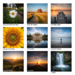
5. The Modular Collage
Divide your page into a series of squares and rectangles (modules). Fill some with photos, some with solid colors, and others with text. This “Pinterest-style” layout is great for “Best of” lists or product showcases.
6. Geometric Overlays
Use circles, triangles, or hexagons to frame your photos. Overlap these shapes over your text columns to create a sense of depth. This technique adds a modern, tech-focused vibe to your magazine design.
7. The Q&A Interview Layout
For interviews, use a distinct color for the interviewer’s questions and a standard black for the subject’s answers. Incorporate a large “pull quote” in the center of the page to highlight a provocative statement.
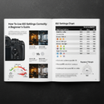
8. Infographic-Driven Pages
If your content is data-heavy, ditch the long paragraphs. Use icons, charts, and bold numbers to tell the story. This makes complex information digestible and visually engaging for a modern audience.
9. Monochromatic Themes
Pick one color and use various shades of it throughout the spread. Match the headline color to a prominent color in the lead photograph. This creates a highly cohesive and sophisticated look.
10. Overlapping Text and Imagery
Place your headline so that it partially overlaps a person’s head or an object in a photo. This creates a 3D effect. To do this successfully, ensure the text remains legible by using high-contrast colors.
11. The “Big Drop Cap” Start
Start your article with a massive drop cap that spans several lines of text. This is a classic editorial technique that signals to the reader exactly where the story begins.
12. Dual-Tone Color Schemes
Limit your palette to just two colors (plus black and white). This constraint often leads to more creative solutions and gives your magazine a very specific, branded identity.
13. Vertical Text Alignment
Rotate your headlines or sub-headlines 90 degrees so they run vertically along the edge of the page. This breaks the horizontal flow and forces the reader to pause and engage with the design.
14. The “Film Strip” Gallery
Place a series of small, related photos in a horizontal row across the middle of the spread, mimicking a film strip. Place the text above and below the strip. This is perfect for step-by-step guides or chronological stories.
15. Bordered Elegance
Instead of bleeding images to the edge, place a thick, consistent white border around every element on the page. This creates a “framed” look that feels organized and classic, similar to a gallery wall.
Essential Software for Magazine Design
To bring these creative magazine layout ideas to life, you need the right tools. Depending on your budget and skill level, here are the top recommendations:
- Adobe InDesign: The industry standard. It offers unparalleled control over typography, grids, and long-form document management.
- Affinity Publisher: A powerful, lower-cost alternative to InDesign with no subscription fee. It is excellent for professional-grade layouts.
- Canva: Ideal for beginners who need a user-friendly interface. Canva offers thousands of magazine templates, though it lacks the advanced typographic controls of professional software.
- Lucidpress (Marq): A browser-based tool that strikes a balance between Canva’s ease of use and InDesign’s layout power.
Step-by-Step Guide: How to Create Your First Magazine Layout
Creating a layout requires a systematic approach. Follow these steps to ensure a smooth design process.
Step 1: Define Your Purpose and Audience
Who are you writing for? A corporate magazine for shareholders will look very different from a street-style fashion zine. Define your “mood board” by collecting inspiration from Pinterest or other publications.
Step 2: Content Gathering and Editing
Never start designing without your final text and high-resolution images. Designing with “Lorem Ipsum” (filler text) often leads to problems later when the real text doesn’t fit the space you allocated.
Step 3: Set Up Your Document and Grid
Open your software and set your page size (usually A4 or US Letter). Set your margins (at least 15-20mm) and your bleed (usually 3mm). Establish a 12-column grid; this is the most flexible grid for beginners as it can be divided into 2, 3, 4, or 6 columns.
Step 4: Sketch Your “Thumbnail” Layouts
Before touching the computer, grab a pen and paper. Sketch small versions of your spreads. Decide where the “Hero Image” will go and how the text will flow. This saves hours of aimless clicking later.
Step 5: Place Your Hero Elements
Start with the most important visual element—usually the lead image or the headline. Once the “anchor” of the page is set, everything else will fall into place around it.
Step 6: Refine Typography and Flow
Insert your body text. Adjust the font size (usually 9pt to 11pt for body copy) and leading. Ensure there are no “widows” (a single word at the end of a paragraph) or “orphans” (a single line at the top of a new column).
Step 7: Final Review and Export
Check your alignment one last time. Ensure all images are in CMYK color mode for print or RGB for digital. Export as a “Press Quality PDF” with crop marks and bleed.
Expert Tips for Professional Results
- Be Consistent: Use the same paragraph styles, character styles, and color palettes throughout the entire magazine to create a cohesive brand.
- Focus on the Cover: The cover is your “sales pitch.” It should have a clear focal point and compelling headlines that make people want to look inside.
- Use High-Resolution Images: Never use images below 300 DPI (dots per inch) for print. Blurry images will immediately ruin a professional layout.
- Print a Physical Proof: Elements often look different on paper than they do on a backlit screen. Always print a test page to check font readability.
Conclusion
Mastering creative magazine layout ideas is a journey of constant experimentation. As a beginner, the key is to balance creativity with readability. Start by following the rules of grids and hierarchy, and as you gain confidence, begin to break those rules to develop your unique style.
Remember, the best magazine layouts are those that serve the story. Your design should never distract from the content; instead, it should enhance the reader’s understanding and emotional connection to the piece. Now, grab your software of choice and start creating!
Frequently Asked Questions (FAQ)
What is the most common magazine size?
The most common sizes are A4 (210 x 297mm) in Europe and International regions, and US Letter (8.5 x 11 inches) in North America.
How many fonts should I use in a magazine layout?
For beginners, it is best to stick to 2 or 3 font families. Use one for headlines, one for body text, and perhaps a third for “accent” text like pull quotes or captions.
What is the difference between a margin and a gutter?
Margins are the empty spaces between the content and the edge of the page. The gutter is specifically the inside margin where the two pages meet at the binding.
Can I design a magazine in Microsoft Word?
While possible, it is not recommended. Word is a word processor, not a layout tool. It lacks the precise control over grids, bleeds, and image placement required for professional editorial design.
What is a pull quote?
A pull quote is a short excerpt from an article that is displayed in a larger, more graphic font to draw attention to a specific point and break up large blocks of text.