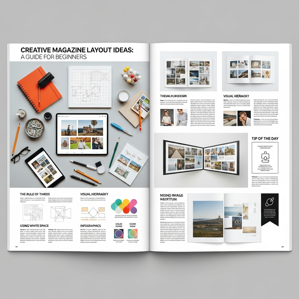
Creative Magazine Layout Ideas: A Comprehensive Beginner’s Guide to Editorial Design
The art of magazine design is much more than simply placing text and images on a page. It is a sophisticated form of visual storytelling that guides the reader through a narrative journey. Whether you are working on a high-fashion monthly, a niche lifestyle zine, or a corporate digital publication, understanding creative magazine layout ideas is essential to capturing and holding your audience’s attention.
In this extensive guide, you will learn the fundamental principles of editorial design, explore innovative layout concepts, and discover how to balance aesthetics with functionality. If you are a beginner looking to transform a blank canvas into a professional-grade publication, you are in the right place.
Understanding the Foundation: Why Layout Matters
Before diving into specific creative magazine layout ideas, it is crucial to understand the “why” behind the design. A layout serves as the roadmap for your reader. Without a clear structure, even the most compelling content can become overwhelming or ignored.
A well-executed magazine layout achieves three primary goals:
- Navigation: It helps the reader find information quickly.
- Hierarchy: It signals which stories or elements are most important.
- Engagement: It uses visual cues to keep the reader interested from the first page to the last.
The Anatomy of a Professional Magazine Spread
To create professional layouts, you must speak the language of editorial designers. Familiarize yourself with these core components:
- The Masthead: The title of the magazine, usually found on the cover.
- The Headline: The largest text on a spread, designed to grab attention.
- The Deck (Lede): A short summary that bridges the headline and the body text.
- Body Copy: The main text of the article.
- Pull Quotes: Key phrases pulled from the text and enlarged to break up long blocks of copy.
- Folio: The page number and publication details, usually at the bottom or side.
- White Space (Negative Space): The empty areas around design elements that allow the layout to “breathe.”
1. Mastering the Grid System
Every great creative magazine layout idea starts with a grid. A grid is an invisible structure of intersecting vertical and horizontal lines that helps you organize content consistently.
The Modular Grid
The modular grid divides the page into small rectangles (modules). This is perfect for complex layouts with many different elements, such as news magazines or product catalogs. It provides a sense of order and allows for precise alignment.
The Column Grid
Most magazines use a 2, 3, or 12-column grid. A 12-column grid is particularly popular among pros because it is highly flexible—you can span content across 2, 3, 4, or 6 columns easily while maintaining mathematical harmony.
The Hierarchical Grid
Unlike fixed grids, hierarchical grids are based on the intuitive placement of elements. This is often used in digital magazines or experimental art publications where the flow of information is more organic than structured.
2. 10 Creative Magazine Layout Ideas to Inspire You
Let’s explore specific styles and concepts you can implement in your next project.
Idea #1: The Minimalist Spread
Minimalism is about “less is more.” Use generous amounts of white space, a single high-quality photograph, and a clean sans-serif typeface. This style is highly effective for luxury brands and art journals where the imagery needs to speak for itself.
Idea #2: The Typographic Hero
In this layout, the typography is the image. Use a massive, stylized font for the headline that takes up 70% of the page. You can wrap body text around the letters or even use the letters as frames for images. This creates a bold, modern look.
Idea #3: The Asymmetric Balance
Perfect symmetry can sometimes feel stagnant. Try placing a large image on the left page and a small block of text in the bottom right corner of the right page. This creates a visual tension that leads the reader’s eye across the entire spread.
Idea #4: The Photo Montage
Instead of one large image, use a collection of smaller photos of varying sizes. Arrange them in a way that tells a chronological or thematic story. Ensure there is a consistent “gutter” (the space between images) to keep the look organized.
Idea #5: The Brutalist Aesthetic
Brutalism ignores traditional design rules. It uses “ugly” fonts, raw textures, and overlapping elements. While risky, it is incredibly popular in youth culture and street-style magazines.
Idea #6: The Data-Driven Layout
If your article is full of statistics, turn them into the focal point. Use large infographics, colorful charts, and bold numbers. This makes complex information digestible and visually stimulating.
Idea #7: The Bordered Framework
Add a consistent border around every page. This creates a “window” effect and can make a magazine feel more like a curated book or a collection of art prints.
Idea #8: The Overlapping Technique
Place text over images or images over text. To maintain readability, use high-contrast colors or semi-transparent “multiply” effects in your design software. This adds depth and a 3D feel to a 2D medium.
Idea #9: The Color Block Approach
Assign a specific background color to an entire spread. If the previous spread was white, a sudden transition to a deep navy or vibrant orange will signal a change in topic and re-energize the reader.
Idea #10: The Interactive Digital Layout
If you are designing for tablets or the web, include elements that imply motion. Use “scroll-triggered” animations or embedded video containers that mimic the look of a traditional print layout but offer modern functionality.
3. The Power of Typography in Editorial Design
Typography is the “voice” of your magazine. You cannot have creative magazine layout ideas without a solid understanding of font pairings.
Serif vs. Sans Serif
Traditional magazines (like The New Yorker or Vogue) often use Serif fonts for body text because they are generally easier to read in long-form print. Sans Serif fonts feel modern and are excellent for headlines and digital screens.
Establishing a Type Hierarchy
You should establish a “Type Scale” before you start. This includes:
- Level 1: Headline (Bold, large, unique).
- Level 2: Subheadlines (Medium size, used to break up text).
- Level 3: Body Copy (Legible, 9pt to 11pt size).
- Level 4: Captions and Folios (Smallest, often italicized or light weight).
4. Working with Color Palettes
Color evokes emotion and creates brand recognition. When choosing a color palette for your magazine layout, consider the following:
1. The 60-30-10 Rule: Use a dominant color for 60% of the layout, a secondary color for 30%, and an accent color for 10%.
2. Source from Imagery: Use the “Eyedropper” tool to pick colors directly from your lead photograph. This ensures the text and images feel unified.
3. Contrast is Key: Never sacrifice legibility for style. Light text on a dark background (knockout text) looks great but can be tiring for the eyes if used for long articles.
5. Essential Software for Magazine Design
To bring these creative magazine layout ideas to life, you need the right tools.
- Adobe InDesign: The industry standard. It offers the best tools for grid management, master pages, and print preparation.
- Affinity Publisher: A powerful, budget-friendly alternative to InDesign with no subscription fees.
- Canva: Great for absolute beginners or simple digital zines, though it lacks the advanced typographic controls of professional software.
- QuarkXPress: A classic tool still used by many high-end publishing houses.
6. Step-by-Step: How to Design Your First Layout
Follow this workflow to ensure a professional result:
Step 1: Content Audit
Before opening your software, know exactly how much text and how many images you have. A design is only as good as the content it supports.
Step 2: Sketching (Thumbnails)
Grab a pen and paper. Sketch 5-10 “thumbnail” versions of your spread. This allows you to explore creative magazine layout ideas quickly without getting bogged down by software technicalities.
Step 3: Setup the Document
In InDesign or Publisher, set your page size (usually A4 or US Letter), margins, and bleeds. Bleed is the extra 3mm of space outside the trim line that ensures images go all the way to the edge after printing.
Step 4: Place the “Anchor” Element
Every spread needs an anchor—usually a large image or a massive headline. Place this first, as everything else will revolve around it.
Step 5: Flow the Text
Import your body copy. Use “Paragraph Styles” to ensure consistency across all pages. Adjust your tracking and kerning (the space between letters) to avoid “widows” and “orphans” (single words left alone at the end of a paragraph or page).
Step 6: Add “Eye Candy”
This is where you add pull quotes, drop caps, lines, and decorative elements that make the page pop.
7. Common Mistakes Beginners Should Avoid
Even with the best creative magazine layout ideas, small errors can ruin the professional look of your publication.
- Ignoring the Gutter: Don’t place important text or faces in the center fold (the gutter), or they will disappear when the magazine is bound.
- Overcrowding: Beginners often fear empty space. Remember, white space is a design element, not “wasted” space.
- Too Many Fonts: Stick to 2 or 3 font families max. Using too many fonts makes the layout look messy and amateurish.
- Low-Resolution Images: For print, images must be 300 DPI. Anything less will look blurry and pixelated.
8. Future Trends in Magazine Design
As we move further into the digital age, magazine design is evolving. We are seeing a rise in “Scrollytelling”—long-form digital articles that use parallax effects and triggered animations to create an immersive experience.
Furthermore, eco-friendly print design is becoming a priority. Designers are using “Eco-fonts” that use less ink and choosing layout styles that work well on recycled, uncoated paper stocks, which absorb ink differently than glossy paper.
Conclusion: Finding Your Unique Style
The world of editorial design is vast and rewarding. By mastering the grid, understanding typography, and experimenting with creative magazine layout ideas, you can create a publication that not only informs but also inspires.
Remember that the best designers are also the best observers. Pick up your favorite magazines, analyze their grids, measure their margins, and try to deconstruct why their layouts work. With practice and patience, you will move from a beginner to a pro, creating layouts that leave a lasting impression on every reader.
Frequently Asked Questions (FAQ)
What is the most important element of a magazine layout?
The most important element is visual hierarchy. It tells the reader where to look first, second, and third, ensuring the message is communicated effectively.
How many pages should a beginner magazine be?
For a standard printed magazine, page counts should be in multiples of four (e.g., 8, 12, 16, 20 pages) due to the way paper is folded and bound.
Can I design a magazine in Microsoft Word?
While technically possible, it is not recommended. Word lacks the precise layout, color management (CMYK), and bleed tools required for professional printing. Tools like Adobe InDesign or Canva are much better suited for the task.
What is the difference between a spread and a page?
A page is one side of a sheet of paper. A spread is a pair of facing pages (left and right) that the reader sees simultaneously when the magazine is open. Most editorial design is done at the “spread” level.
How do I choose the right font for my magazine?
Consider the “mood” of your content. A fashion magazine might use a high-contrast Serif (like Didot), while a tech magazine might use a geometric Sans Serif (like Futura or Helvetica). Always test for legibility at small sizes.