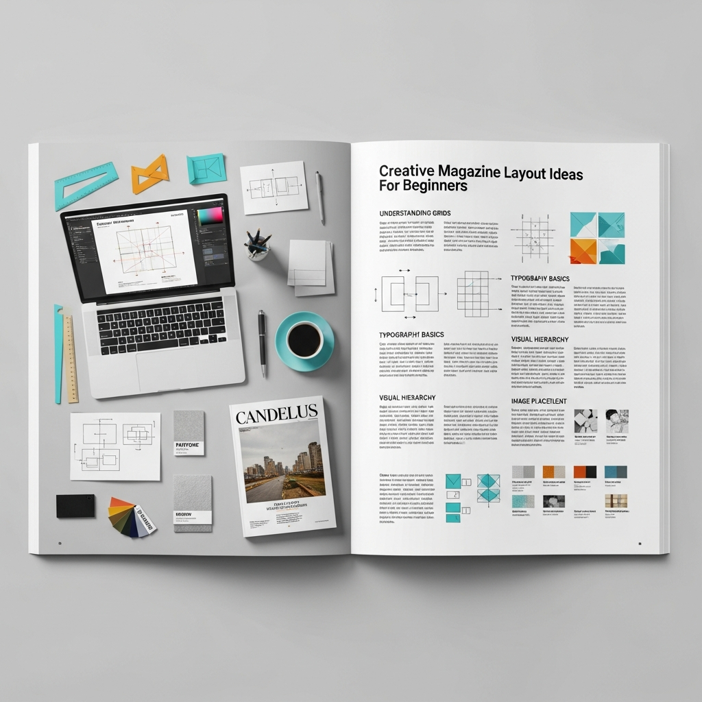
15+ Creative Magazine Layout Ideas: The Ultimate Guide for Beginners
In an era dominated by rapid digital consumption, the art of magazine design remains a cornerstone of impactful storytelling. Whether you are venturing into print media or launching a digital zine, the way you arrange your content determines how your audience perceives your brand. A well-executed design does more than just look “pretty”—it guides the reader’s eye, emphasizes key messages, and creates an emotional connection.
This comprehensive guide explores creative magazine layout ideas tailored specifically for beginners. We will delve into the fundamental principles of editorial design, step-by-step workflows, and professional tips to help you transform a blank page into a masterpiece of visual communication.
Understanding the Core Principles of Magazine Design
Before jumping into specific layout ideas, you must understand the “DNA” of a professional magazine. Professional designers don’t just place elements randomly; they follow a set of established rules that ensure readability and aesthetic harmony.
1. The Power of the Grid System
The grid system is the invisible skeletal structure of your page. It consists of columns, gutters (the space between columns), and margins. For beginners, a standard 12-column grid is highly recommended because it offers immense flexibility, allowing you to span content across 2, 3, 4, or 6 columns easily.
2. Establishing Visual Hierarchy
Visual hierarchy tells the reader what to look at first. By varying the size, color, and weight of fonts, you can signify importance. Typically, the headline is the largest element, followed by the sub-headline (lede), and then the body copy. Using high-contrast elements helps prevent the page from looking flat and uninteresting.
3. Embracing White Space
One of the most common mistakes beginners make is “filling every corner.” In professional editorial design, white space (or negative space) is your best friend. It provides “breathing room” for the reader’s eyes, making the content feel more luxurious, organized, and digestible.
15+ Creative Magazine Layout Ideas to Inspire Your Next Project
Here are diverse layout styles you can implement, ranging from minimalist aesthetics to bold, experimental designs.
1. The Minimalist Scandi-Style
Focus on extreme simplicity. Use a single, high-quality photograph on one page and a modest amount of text with generous margins on the facing page. This style is perfect for lifestyle, architecture, or high-end fashion magazines.
2. The Typographic Hero
In this layout, the text is the image. Use a massive, bold serif or sans-serif font that spans across the entire spread. This creates an immediate impact and works exceptionally well for opinion pieces or interviews with influential figures.
3. The Asymmetrical Grid
Break the rules by placing elements off-center. An asymmetrical layout creates a sense of movement and energy. It’s often used in modern art or culture magazines to signify a “rebellious” or “cutting-edge” brand identity.
4. Overlapping Elements
Layering text over images (or vice versa) adds depth. You can have a subject’s head in a photo “cut out” and placed in front of a large headline to create a 3D effect. Ensure the text remains legible by using high-contrast colors.
5. The “Big Image” Spread
Sometimes, a photograph is so powerful it deserves two full pages. Place a breathtaking landscape or portrait across the center fold (the gutter), but be careful not to put important details like faces or text directly in the middle where they might get lost in the binding.
6. The Modular Grid
Divide your page into small, equal-sized rectangles. This is excellent for “gift guides,” “product roundups,” or “top 10 lists.” It keeps a lot of information organized and easy to scan.
7. The Dark Mode Aesthetic
While most magazines use white backgrounds, a black or dark-themed background with white or neon text can look incredibly sophisticated. This is a popular choice for technology, night-life, or luxury automotive features.
8. Geometric Overlays
Use shapes like circles, triangles, or diagonal lines to frame your images. This breaks the “boxiness” of traditional layouts and adds a graphic design flair that appeals to younger audiences.
9. The Collage/Zine Look
If your magazine is about punk culture, indie music, or street art, a “cut-and-paste” aesthetic works wonders. Use mismatched fonts, “handwritten” notes, and layered textures to give it a raw, authentic feel.
10. Vertical Typography
Rotate your headlines 90 degrees. Vertical text is a simple yet effective way to grab attention and make a spread look more avant-garde. Use this sparingly for maximum effect.
11. Color Blocking
Assign a specific bold color to a whole section of the page. This helps categorize content and creates a strong visual anchor for the accompanying text and images.
12. The “Window” Layout
Use a large image with a “cut-out” window where the text is placed inside. This integrates the story directly into the visual environment of the photography.
13. High-Contrast Duotone
Limit your color palette to just two colors (e.g., blue and orange). Apply this filter to your photos and use the same colors for your typography. This creates a highly cohesive and artistic brand look.
14. Integrated Pull Quotes
Don’t just place pull quotes in a corner. Make them huge and wrap the body text around them. A well-placed pull quote can act as a visual bridge between two different topics on a page.
15. The “Film Strip” Sequence
Place a series of small, sequential photos horizontally across the bottom or top of the page. This is great for storytelling, showing a process, or depicting movement in sports and dance.
The Anatomy of a Magazine Page: Essential Elements
To execute these creative magazine layout ideas, you must familiarize yourself with the technical components of a page:
- Masthead: The title of the magazine on the cover.
- Headline: The main title of the article.
- Lede (Lead): The introductory paragraph that bridges the headline and the body.
- Body Copy: The main text of your story.
- Pull Quote: A key excerpt from the text used as a graphic element.
- Folio: The page number, magazine title, and issue date (usually at the bottom).
- Byline: The name of the writer and photographer.
- Caption: Brief descriptions located near images.
Step-by-Step Guide: How to Design Your First Magazine Layout
If you are a beginner, follow this workflow to ensure a professional result.
Step 1: Define Your Concept and Moodboard
Before opening any software, decide on the “vibe.” Are you going for corporate, edgy, or elegant? Collect inspiration from Pinterest or sites like Behance to create a moodboard of colors, fonts, and photography styles.
Step 2: Choose Your Software
While professionals use Adobe InDesign, beginners might find Affinity Publisher or even Canva more accessible. InDesign is the industry standard for a reason: its master pages and styles make managing long documents easy.
Step 3: Set Up Your Document
- Size: Standard A4 or Letter (8.5″ x 11″).
- Margins: At least 12mm to 20mm to prevent text from being too close to the edge.
- Bleed: Crucial for print. Set a 3mm bleed so your images can run off the edge of the paper without leaving white lines after trimming.
Step 4: Establish the Grid
Set up a column grid. Even if you don’t follow it perfectly, having those guides will help you align your elements consistently across different pages.
Step 5: Place Your “Anchor” Image
Start with your strongest visual. Place it on the page and let it dictate where the headline and body text will go.
Step 6: Apply Typography Styles
Choose two primary fonts: one for headlines (can be decorative) and one for body text (must be highly legible). Maintain consistency in font sizes throughout the magazine.
Step 7: Review and Refine
Print out your layout if possible. Elements often look different on paper than on a bright screen. Check for “widows” and “orphans” (single words left alone at the end of a paragraph or top of a column).
Top Tips for Mastering Editorial Design
- Consistency is King: While every spread can be unique, use consistent margins, folios, and body text fonts to tie the whole magazine together.
- Use High-Resolution Images: Never use images below 300 DPI (dots per inch) for print. Blurry photos will instantly ruin a professional layout.
- Check Your Gutters: Ensure that important text or parts of a face aren’t placed in the “gutter” (the middle fold), or they will be unreadable once the magazine is bound.
- Readability First: Never sacrifice legibility for “art.” If your audience can’t read the text because the background is too busy, your design has failed its primary purpose.
- Study the Pros: Pick up a copy of Vogue, Wired, or The New Yorker. Analyze their use of white space and how they handle complex information.
Essential Tools for Magazine Designers
- Adobe InDesign: The gold standard for layout design.
- Adobe Photoshop: For editing and retouching images.
- Adobe Illustrator: For creating vector graphics and logos.
- Canva: A great entry-level tool with many pre-made magazine templates.
- Adobe Fonts / Google Fonts: Sources for professional-grade typography.
- Unsplash / Pexels: High-quality, royalty-free stock photography for practice.
Common Mistakes to Avoid
- Too Many Fonts: Stick to 2 or 3 font families. Using 5+ fonts makes the page look cluttered and amateurish.
- Ignoring Margins: Text that is too close to the edge feels “suffocated.” Give your content room to breathe.
- Poor Contrast: Avoid dark text on dark backgrounds. Always prioritize the reader’s ease of use.
- Inconsistent Spacing: Ensure the space between your headlines, sub-headlines, and body copy is uniform throughout the article.
Conclusion: Start Your Creative Journey Today
Creating a magazine layout is a rewarding blend of logic and creativity. By mastering the grid system, respecting visual hierarchy, and experimenting with creative magazine layout ideas, you can produce work that rivals professional publications.
Remember, the best way to learn is by doing. Start with a simple two-page spread, experiment with different typography, and don’t be afraid to break the rules once you understand why they exist. Your unique perspective is what will ultimately make your magazine stand out in a crowded marketplace.
Frequently Asked Questions (FAQ)
What is the best software for magazine design for beginners?
For absolute beginners, Canva is the easiest because of its drag-and-drop interface. However, if you want to learn professional skills, Adobe InDesign is the best investment, followed by Affinity Publisher as a more affordable one-time purchase alternative.
How many columns should I use in my magazine grid?
A 12-column grid is the most versatile for beginners. It allows you to easily create layouts with 2, 3, or 4 columns of text, giving you the flexibility to mix and match different content types on a single page.
What font size is standard for magazine body text?
Typically, body text in a printed magazine is between 9pt and 11pt. While this may seem small on a computer screen, it is the standard for comfortable reading on physical paper.
How do I make my magazine layout look professional?
Focus on three things: consistent alignment, generous white space, and high-quality photography. Avoid cluttering the page and ensure there is a clear visual hierarchy so the reader knows where to start.
Can I design a magazine for free?
Yes, you can use tools like Canva’s free version or open-source software like Scribus. For high-quality free fonts, use Google Fonts, and for images, use Unsplash or Pexels.