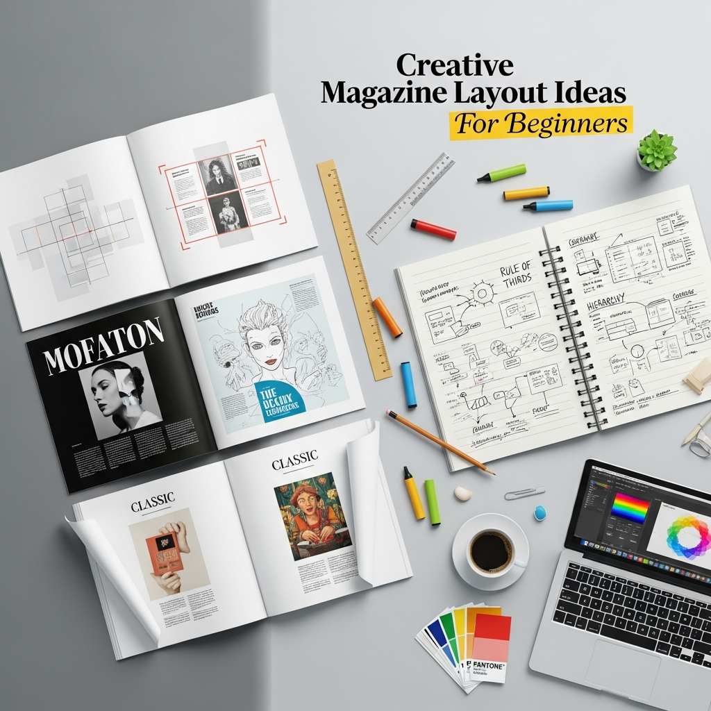
15 Creative Magazine Layout Ideas: A Beginner’s Masterclass in Editorial Design
In the digital age, where content is consumed in seconds, the art of magazine design remains a powerful medium for storytelling. Whether you are creating a digital zine, a corporate brochure, or a high-end fashion print, the way you arrange elements on a page determines how your audience perceives your brand.
For a beginner, a blank canvas can be intimidating. However, professional editorial design is not just about “making things look pretty.” It is a strategic blend of psychology, visual hierarchy, and technical precision. This guide provides you with creative magazine layout ideas and the foundational knowledge required to transform your concepts into professional-grade spreads.
1. Understanding the Anatomy of a Magazine Page
Before diving into creative ideas, you must understand the structural components that make up a standard layout. Consistency in these elements ensures readability and professional polish.
- Masthead: The title of the magazine, usually found on the cover but often referenced in a simplified form on internal pages.
- Folio: This includes the page number, the magazine title, and the issue date, usually placed at the bottom or top corners.
- Headline (Display Type): The largest text on the page, designed to grab immediate attention.
- Deck (Lede): A short paragraph that bridges the headline and the body text, summarizing the article’s intent.
- Pull Quotes: Key phrases extracted from the text and enlarged to break up long blocks of copy.
- Byline: The name of the writer and photographer.
- Body Text: The main narrative, typically set in a highly legible serif or sans-serif font.
2. The Core Principles of Successful Layouts
To execute creative magazine layout ideas effectively, you must adhere to four pillars of design:
The Grid System
The grid is the invisible skeleton of your page. Most magazines use a 12-column grid because it allows for maximum flexibility—you can divide the page into two, three, four, or six columns. Grids ensure that your images and text boxes are aligned, creating a sense of order.
Visual Hierarchy
You must guide the reader’s eye. What should they see first? Usually, it is a large image or a bold headline. What should they see second? The deck or a pull quote. Hierarchy prevents the reader from feeling overwhelmed by information.
The Power of White Space
Negative space (or white space) is not “wasted” space. It is a functional tool that provides “breathing room” for the eyes. High-end, luxury magazines often use generous white space to convey a sense of elegance and sophistication.
Typography Selection
Limit your layout to two or three font families. Use a “Display” font for headlines and a “Body” font for the main text. Contrast is key—pairing a bold serif headline with a clean sans-serif body is a classic, foolproof technique.
3. 15 Creative Magazine Layout Ideas for Beginners
Here are fifteen practical and inspiring layout concepts you can implement in your next project.
1. The Minimalist Hero Spread
This idea focuses on one high-quality image that spans across two pages (a double-page spread). Place the headline in a corner with significant white space around it. This layout is perfect for fashion or travel features where the photography is the main attraction.
2. The Asymmetrical Grid
Break away from perfect symmetry. By placing a large image on the left and offsetting the text columns on the right, you create a dynamic sense of movement. Asymmetry feels modern and edgy, making it ideal for art or lifestyle magazines.
3. Bold Typography as Art
Sometimes, you don’t need a photograph. Use a massive, stylized font that takes up 70% of the page. Let the letters overlap or wrap around smaller text blocks. This turns the headline itself into a visual element.
4. Overlapping Elements
Layering creates depth. Try placing a text box slightly over the edge of an image, or have a subject in a photo “pop out” and overlap a headline. This technique breaks the “boxiness” of standard layouts.
5. The “Big Number” Listicle
If you are writing a “Top 10” or “Best Of” article, use oversized numbers as the primary design feature. Make the numbers colorful or textured to act as anchors for each section of text.
6. Geometric Color Blocking
Use solid shapes (rectangles, circles, or triangles) in bold colors to house different sections of content. Color blocking is an excellent way to organize a page that has many small snippets of information without it looking cluttered.
7. The Handwritten Touch
Incorporate “handwritten” annotations, underlines, or scribbles. This adds a personal, human touch to the design, making it feel like a scrapbook or a personal journal. It works wonders for “How-To” guides or DIY sections.
8. Monochromatic Themes
Pick one color and use various shades and tints of that color for the entire spread. This creates an incredibly cohesive and professional look that is easy on the eyes.
9. Brutalist Design
Inspired by the “Brutalist” architectural style, this layout uses raw, unpolished elements. Think heavy borders, monospaced fonts (like Courier), and a lack of traditional “beauty.” It is very popular in indie music and underground culture magazines.
10. Data-Driven Infographics
Instead of long paragraphs, use charts, maps, and icons to tell the story. This is essential for business or science magazines where complex data needs to be simplified for the reader.
11. The Diagonal Break
Most layouts are horizontal or vertical. By tilting your text or images at a slight angle (5-10 degrees), you instantly create energy and a sense of “disruption” that catches the eye.
12. Silhouette and Negative Space
Cut the background out of your main subject (e.g., a person or a product) and place it against a solid color. This removes distractions and forces the reader to focus entirely on the subject.
13. Magazine-within-a-Magazine
Create a distinct visual style for a specific section (like a 4-page special report) that differs from the rest of the magazine. Use different paper textures (in print) or a completely different color palette to signal the transition.
14. Retro/Vintage Aesthetic
Use muted, earthy tones and grainy textures to mimic 1970s or 80s print styles. Pair this with serif fonts that have high contrast to evoke nostalgia.
15. The Collage Style
Mix photography, illustrations, and cut-out text. This “zinesque” approach is chaotic but intentional. It is highly effective for creative portfolios or experimental editorials.
4. Step-by-Step Guide: Designing Your First Layout
Following a structured process will save you hours of frustration.
Step 1: Content Audit
Before opening any design software, read the article. Identify the “hook,” the most important quote, and the number of images available. You cannot design a layout without knowing what content it must hold.
Step 2: Sketch a Thumbnail
Use a pen and paper to draw small rectangles (thumbnails) of your spread. Experiment with where the images and headlines will go. It is much faster to iterate on paper than on a computer.
Step 3: Set Up Your Master Pages
In software like Adobe InDesign or Affinity Publisher, set up your margins and columns. Use “Master Pages” for elements that repeat, such as folios and page numbers, to ensure they are in the exact same spot on every page.
Step 4: Establish the Visual Anchor
Place your largest visual element first. This is usually your “Hero Image.” Everything else on the page will be positioned in relation to this anchor.
Step 5: Refine Typography
Adjust the “Leading” (space between lines) and “Kerning” (space between letters). For body text, ensure the lines aren’t too long; 50-70 characters per line is the sweet spot for readability.
Step 6: The “Squint Test”
Lean back and squint at your screen. If the page looks like a balanced blur, your layout is likely successful. If one part looks too “heavy” or dark, you may need to add more white space or reduce the size of an element.
5. Essential Tools for Magazine Design
Depending on your skill level and budget, here are the top recommendations:
- Adobe InDesign: The industry standard for professional print and digital publishing. It offers the most control over typography and grids.
- Affinity Publisher: A powerful, one-time-purchase alternative to InDesign. It is excellent for beginners who want professional features without a subscription.
- Canva: Ideal for very basic digital magazines. While it lacks advanced typographic controls, its drag-and-drop interface and templates are perfect for hobbyists.
- Adobe Express: A middle ground between Canva and InDesign, offering great templates with better integration into the Adobe ecosystem.
6. Common Mistakes Beginners Should Avoid
- Overcrowding: Trying to fit too much text and too many images onto one page. If the content is too long, add more pages rather than shrinking the font.
- Poor Image Quality: Never use low-resolution (pixelated) images. For print, images must be 300 DPI. For digital, 72-150 DPI is acceptable but must look sharp.
- Centering Everything: Beginners often center all text and images. This creates a static, boring layout. Use the grid to align elements to the left or right for a more professional look.
- Ignoring the “Gutter”: The gutter is the space where the two pages meet in the middle. Do not place important text or someone’s face directly in the gutter, as it will be lost in the binding.
7. Expert Tips to Elevate Your Designs
- Use Drop Caps: Starting an article with a large “Drop Cap” (an oversized first letter) is a classic editorial technique that signals the start of a story.
- Consistent Color Palette: Use the “Eyedropper” tool to pick colors from your main photograph and use those colors for your headlines and accents.
- Vary Your Page Pace: Not every page should be high-energy. Balance a busy, image-heavy spread with a quieter, text-focused page to give the reader a mental break.
- Focus on the Cover: The cover is your most important “layout.” It must have one clear focal point and a hierarchy of “cover lines” (teaser headlines) that entice the reader to look inside.
8. Frequently Asked Questions (FAQ)
Q: What is the best font size for a magazine?
A: For body text, 9pt to 11pt is standard. Headlines can range from 24pt to 200pt depending on the design.
Q: How many columns should I use?
A: A 2-column or 3-column setup is most common for readability. However, using a 12-column grid “underneath” allows you to span text across two columns while leaving the third for captions.
Q: Should I design in RGB or CMYK?
A: If you are printing your magazine, use CMYK. If it is only for digital viewing (PDF or website), use RGB.
Q: How do I choose a color scheme?
A: Look at the mood of your content. Use “Cool” colors (blues/greens) for calming subjects and “Warm” colors (reds/oranges) for high-energy or food-related content.
Conclusion
Creating a compelling magazine layout is a journey of discovery. By mastering the grid, respecting white space, and experimenting with these creative magazine layout ideas, you can move from a beginner to a confident designer. Remember that the best layouts are those that serve the story. Every design choice you make should help the reader understand and enjoy the content more deeply.
Now it is time to open your software of choice, set up your grid, and start bringing your vision to life!