Mastering the art of visual storytelling is paramount for any photographer aiming to deliver truly impactful images. The best Composition Tips for Professional Photos focus not just on following rigid structures, but on using visual grammar to direct the viewer’s eye and evoke a specific feeling. Strong composition transforms a mere snapshot into a deliberate work of art, elevating its perceived value and emotional resonance. The core elements often involve intentional placement of the subject, thoughtful use of lines, and the interplay of light and shadow, all working in harmony to create a compelling frame.

—
What is the most important composition tip for professional photography?
The most important composition tip for professional photography is intentionality. It means every element in the frame—from the subject’s placement to the background’s texture—is a conscious choice to serve a clear creative vision. This principle outweighs any single “rule,” as a professional image must communicate purpose.
Here are the foundational elements professionals prioritize:
- Focal Point: Establishing a single, clear point of interest.
- Framing: Using natural elements to draw attention to the subject.
- Visual Balance: Ensuring elements don’t make the image feel heavier on one side.
- Depth Creation: Employing foreground, midground, and background layers.
These Composition Tips for Professional Photos ensure the image holds the viewer’s attention and conveys the intended message effectively.
—
The Unbreakable Pillars: Classic Composition Tips for Professional Photos
Even as visual trends shift and technology advances, certain compositional principles remain timeless. These pillars serve as the essential foundation for anyone seeking to create genuinely professional imagery. Understanding and applying these classic Composition Tips for Professional Photos is the first step toward visual mastery.
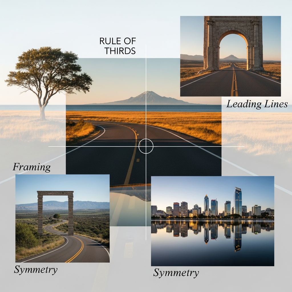
Rule of Thirds: The Gateway to Dynamic Placement
The Rule of Thirds is arguably the most recognized and simplest starting point for composition, offering a framework that breaks the rectangular frame into nine equal parts using two horizontal and two vertical lines. The goal is to avoid placing the subject dead center. Instead, key elements should be aligned along these lines or, even better, at the points where they intersect (known as power points). This off-center placement creates an inherent tension and visual flow that makes the image significantly more engaging than a centered shot.
Why Off-Center Works: Tension and Eye Flow
When you position a subject along one of the vertical lines, you automatically give the image ‘breathing room’ or negative space on the other side. Consider a portrait: placing the subject’s face on the right vertical line, with their gaze directed toward the empty space on the left, implies narrative and gives the eye a path to follow. This negative space is not truly empty; it becomes a secondary element supporting the main subject. In landscape photography, placing the horizon along the top or bottom third line, rather than in the middle, emphasizes either the sky or the foreground, immediately adding drama and intention. The subtle asymmetry introduced by this technique is a powerful Composition Tip for Professional Photos because human perception often finds slightly unbalanced, yet structured, images more appealing and dynamic.
Case Study: The Sunset Shot
Imagine two photos of the same sunset. In Photo A, the photographer centers the horizon and places the sun exactly in the middle. The resulting image is static, dividing the photo into two uninteresting halves. In Photo B, the photographer uses the Rule of Thirds, placing the horizon on the lower third line (to emphasize the vast, colorful sky) and positioning the setting sun on one of the upper-third power points. Photo B is instantly more captivating because the placement of the sun acts as a magnet for the viewer’s eye, and the sky receives the emphasis, creating a sense of grandeur. This simple, yet effective, use of the Rule of Thirds is fundamental among all Composition Tips for Professional Photos.
Leading Lines: Guiding the Viewer’s Journey
Leading lines are physical or implied lines within a scene that draw the viewer’s eye from one part of the image to the main point of interest. They are a crucial Composition Tip for Professional Photos because they create a sense of depth, direction, and movement. These lines can be obvious, like a winding road, a fence, or a river, or more subtle, such as the pattern of shadows, a row of streetlights, or a receding gaze from a model.
The Power of Convergence
The most effective leading lines often converge at a vanishing point, giving the illusion of three-dimensional depth on a two-dimensional plane. When leading lines start in the foreground and narrow as they recede, they create a strong path that pulls the viewer deep into the scene. For example, a professional architectural photographer might use the converging lines of a long hallway to dramatically emphasize a single window or door at the end. This technique is more than just a structural element; it’s a narrative device. By using leading lines, you control the viewing experience, ensuring the audience sees exactly what you intend them to see. This purposeful direction is one of the most powerful Composition Tips for Professional Photos.
Statistics on Engagement
Studies on visual cognition and eye-tracking confirm the profound impact of this technique. Research has shown that photographs utilizing leading line composition techniques effectively guide the viewer’s gaze, often leading to a more thorough exploration of the image and greater engagement with the focal point. This demonstrates that using leading lines is not just an aesthetic choice, but a scientifically proven method for boosting the effectiveness of your images. When crafting high-impact marketing visuals, these Composition Tips for Professional Photos become indispensable tools.
Framing: A Window into the Subject
Natural framing involves using elements within the scene—like a doorway, a window, an archway, or even a gap between tree branches—to create a “frame” around the main subject. This technique serves two primary functions: it draws immediate attention to the subject by isolating it from the surrounding visual noise, and it adds context and depth to the image.
Context and Isolation
A photograph of a person standing in a field is one thing, but a photograph of that same person viewed through a decaying wooden window frame adds layers of story and atmosphere. The frame acts as a visual funnel, compelling the eye to move inward. Furthermore, the frame itself becomes a secondary compositional element, providing a sense of place or mood. Using this kind of internal frame is an advanced Composition Tip for Professional Photos, especially effective in environmental portraiture and street photography, where the goal is to capture a moment within its specific setting. The contrast between the frame (often dark or textured) and the subject (often lighter or sharper) can dramatically enhance the final presentation.
Advanced Composition Tips for Professional Photos: Breaking the Rules with Intention
Once the classic rules are mastered, professional photography composition moves into more conceptual and abstract territory. The goal shifts from merely organizing elements to manipulating the viewer’s perception and emotional response. These advanced Composition Tips for Professional Photos are what separate competent photographers from true artists.
The Golden Ratio (Fibonacci Spiral): Nature’s Perfect Curve
While the Rule of Thirds is a useful simplification, the Golden Ratio (approximately 1.618) provides a mathematically harmonious proportion that often appears in nature and classical art. When applied to photography, it manifests as the Fibonacci Spiral, a logarithmic spiral that gently guides the eye from the outer edges of the frame to the point of interest.
Applying the Spiral
Using the Golden Ratio is a sophisticated Composition Tip for Professional Photos that requires a more nuanced approach than the simple grid of the Rule of Thirds. You would typically place the most important element of your photograph at the tightest point of the spiral’s curve, where the eye naturally comes to rest. The spiral itself then acts as a gentle leading line, starting wide and slowly contracting towards the focal point. This creates a sense of fluid movement and organic balance that is deeply satisfying to the human eye. In fashion photography, for instance, a model’s posture or the drape of a garment can often be subtly aligned with the spiral to create an image of effortless grace and high-end elegance. Mastering this technique is a hallmark of true mastery in Composition Tips for Professional Photos.
Visual Weight and Balance: Beyond Symmetry
Visual weight refers to how much a particular element attracts the viewer’s eye. Elements that are brighter, larger, sharper, redder, or placed against a plain background typically have more visual weight. Balance in composition is the arrangement of these weights so that the image feels stable and harmonious.
Asymmetrical Balance: The Professional’s Choice
Symmetry (formal balance) is simple: two identical halves. While it can be effective for certain architectural or reflection shots, asymmetrical balance (informal balance) is a more dynamic and preferred Composition Tip for Professional Photos. This involves balancing a large, visually heavy object on one side of the frame with a smaller, more interesting, or brighter object on the other side. For example, a large, dark tree in the foreground can be balanced by a bright, small figure walking far in the background. The visual weight of the large object is counteracted by the intrigue and brightness of the small one. This technique creates a more complex and engaging visual narrative, forcing the viewer to actively engage with the entire frame rather than simply glancing at a centered subject.
Negative Space (Minimalism): The Power of Nothing
Negative space is the area surrounding the main subject. In minimalist photography, this space is not a mere backdrop but an integral compositional element. Using ample negative space is a powerful and increasingly popular Composition Tip for Professional Photos because it emphasizes the subject, reduces clutter, and allows the image to breathe.
The Role of Space in Emotion
The strategic use of negative space can profoundly influence the emotional impact of a photograph. Vast empty space surrounding a small, isolated subject can convey feelings of loneliness, vastness, or tranquility. A large white wall behind a sharply focused product not only isolates the product but also conveys sophistication and cleanliness, a common trope in high-end advertising. The emptiness itself directs 100% of the viewer’s attention to the small, important part. This is an essential Composition Tip for Professional Photos when the goal is a clean, modern aesthetic or a strong emotional statement.
Incorporating Texture, Color, and Light: The Sensory Composition Tips for Professional Photos
Composition is fundamentally about arranging lines and shapes, but a professional image also meticulously organizes sensory elements like texture, color, and light. These elements are the emotional palette that determines the mood and depth of the final image.
Texture and Pattern: Repetition and Disruption
Patterns (the repetition of a shape, color, or line) and texture (the visual representation of a surface’s feel) are potent compositional tools. A uniform pattern, like a tiled floor or a field of flowers, creates a sense of rhythm and calm.

The Value of Disruption
A key advanced Composition Tip for Professional Photos is to introduce a break in the pattern. Placing a unique subject against a uniform background or disrupting a smooth texture with a contrasting element immediately creates a focal point and high visual interest. For instance, a single red umbrella in a crowd of gray, identical umbrellas. The pattern draws the eye in, but the disruption forces the eye to stop and focus on the subject. This interplay of repetition and contrast is a highly effective way to create visually arresting professional images.
Color and Contrast: The Emotional Connection
Color composition is about more than just having bright hues; it’s about the deliberate relationship between colors. Complementary colors (opposite on the color wheel, like blue and orange) create high contrast and vibrancy, often used for dynamic and energetic shots. Analogous colors (next to each other, like blue and green) create harmony and calm, often preferred for subtle and serene scenes.
Color Saturation and Weight
Professionals understand that color saturation affects visual weight. A small, highly saturated patch of color can balance a much larger, desaturated area. Furthermore, specific colors have universal emotional associations. Red is often associated with passion or warning, while blue suggests calm or sadness. Using these chromatic principles intentionally is one of the most powerful, yet overlooked, Composition Tips for Professional Photos. By manipulating the color palette, you are composing the mood of the entire scene, ensuring the image communicates its message before the viewer even consciously processes the subject matter.
Light and Shadow (Chiaroscuro): Sculpting with the Sun
Photography literally means “drawing with light.” Therefore, the arrangement of light and shadow is arguably the ultimate Composition Tip for Professional Photos. Chiaroscuro, the dramatic use of light and shadow, not only reveals texture but also creates form and depth.
The Dynamic Range of Storytelling
Professionals compose their photos to maximize the interplay between highlights and deep shadows. Instead of simply lighting a subject evenly, they use light to sculpt the face or object, creating dimensionality. A strong shadow line can act as a natural leading line, guiding the eye across the frame. In studio portraits, a single, directional light source creates dramatic contrast that emphasizes the subject’s features and mood. By understanding and controlling light, the photographer is not just recording a scene, but fundamentally composing the essence of the moment. This is a critical factor in the list of Composition Tips for Professional Photos, as it directly impacts the image’s emotional depth and technical quality.
Practical Composition Tips for Professional Photos in Modern Contexts
In the contemporary visual landscape, professional photography must adapt to diverse platforms, from high-resolution print to small mobile screens. These modern applications require slight adjustments to traditional Composition Tips for Professional Photos.
Utilizing Aspect Ratio and Cropping
The aspect ratio (the ratio of an image’s width to its height) drastically changes the compositional impact. A square (1:1) composition, popularized by platforms like Instagram, forces the photographer to simplify the scene, as it eliminates the side room available in a traditional 3:2 or 4:3 frame. Conversely, an ultra-wide cinematic (21:9) ratio is ideal for emphasizing vast landscapes or horizontal lines.
Composition for the Crop
A good professional image is composed so that it maintains its impact even when cropped to different aspect ratios. This is achieved by ensuring the main focal point remains strong and the negative space can be adjusted without destroying the balance. When shooting, savvy photographers intentionally leave “crop room” around the subject, ensuring the application of key Composition Tips for Professional Photos (like the Rule of Thirds or Golden Ratio) can be slightly adjusted in post-production to fit a client’s specific needs for different advertising placements.
Shallow Depth of Field (Bokeh): Composing the Background
Depth of field (the range of distance that appears sharp in a photograph) is a compositional choice as much as a technical setting. A shallow depth of field, resulting in a blurred background (often called bokeh), is an essential Composition Tip for Professional Photos in portraiture and product photography.
Isolating the Subject
By using a wide aperture (low f-number), the photographer deliberately de-composes the background, rendering it as a soft wash of color and light. This extreme isolation immediately makes the subject the only focal point, stripping away potential distractions and adding a luxurious, high-end feel. The background is composed only in terms of its color and lightness, acting as a supportive backdrop rather than a competing element. This technique is overwhelmingly prevalent in professional headshots and commercial product photography because it ensures the viewer’s eye goes straight to the intended subject. Mastering depth of field manipulation is a key part of Composition Tips for Professional Photos.
Symmetry and Reflection: The Power of Formal Balance
While asymmetrical balance is often preferred for dynamic shots, the purposeful use of symmetry remains one of the most powerful Composition Tips for Professional Photos, particularly in architectural, landscape, and minimalist photography. Symmetry creates a strong sense of order, formality, and grandeur.
Finding the Mirror
The most common application is reflection, often found in still water or polished surfaces. Placing the line of symmetry directly in the center of the frame (breaking the Rule of Thirds) is the intentional choice here. The professional effect comes from the flawless execution of this balance, making the mirrored image as perfect as possible. When done correctly, the viewer is instantly struck by the harmony and scale of the scene. The deliberate choice to use formal balance, knowing that it contrasts with the more dynamic asymmetrical composition, is an example of a professional composing with intention, a core concept for all Composition Tips for Professional Photos.
Conclusion: The Purpose of Composition Tips for Professional Photos
Ultimately, the plethora of Composition Tips for Professional Photos—from the venerable Rule of Thirds and the mathematical elegance of the Golden Ratio to the emotional impact of color and light—are not rigid mandates. They are a universal language of visual communication. A truly professional image is one where the composition is so effective that the viewer is effortlessly guided through the narrative, feeling the intended emotion without realizing the sophisticated visual engineering behind it.
The continuous practice of applying, adapting, and occasionally defying these principles is what distinguishes the professional from the amateur. Every successful photograph is a testament to the photographer’s ability to intentionally arrange the chaos of the real world into a cohesive and captivating visual statement. By internalizing these advanced Composition Tips for Professional Photos, you move beyond merely taking pictures and begin the deliberate creation of enduring visual art.
—
FAQ
What are the 4 fundamental elements of photographic composition?
The 4 fundamental elements of photographic composition are:
- Focal Point: The single, clear subject or area of interest that captures the viewer’s attention.
- Lines: Used to guide the viewer’s eye, create depth (leading lines), or provide structure (horizontal/vertical lines).
- Shape/Form: The outlines and three-dimensional qualities of objects within the frame, often defined by light and shadow.
- Balance: How the visual weight of elements is distributed across the frame, which can be symmetrical (formal) or asymmetrical (dynamic).
Understanding and combining these elements is essential for all effective Composition Tips for Professional Photos.
How can I make my photos look more professional without changing my camera equipment?
You can make your photos look significantly more professional by focusing solely on mastering composition and light.
- Move Your Feet: Don’t just shoot from eye level. Get lower, higher, closer, or further back to find a unique, more intentional perspective.
- Study the Light: Shoot during the Golden Hour (sunrise/sunset) for warm, soft light, or use dramatic side-lighting to enhance texture and depth.
- Simplify the Scene: Use negative space and shallow depth of field (bokeh) to isolate your subject and eliminate distracting background elements.
- Apply the Rule of Thirds: Consistently place your subject off-center for more dynamic, balanced framing.
Consistent application of these Composition Tips for Professional Photos is far more important than the cost of your gear.
What is ‘Visual Weight’ in the context of composition?
Visual weight is the measure of how much an element in a photograph draws the viewer’s eye and attention. Elements with high visual weight include: large objects, bright colors (especially red and yellow), high contrast areas, sharp focus, and human faces. The principle of visual weight is key to achieving visual balance. For example, a small, brightly colored object on one side of the frame can balance a large, dark object on the other side. Mastering the manipulation of visual weight is a powerful secret behind many advanced Composition Tips for Professional Photos.
Why is the Rule of Thirds considered a composition “tip” and not a “rule”?
The Rule of Thirds is more accurately described as a guide or tip because, while universally effective, the best professional photographers often choose to break it deliberately. Breaking the “rule” to place a subject dead center can create a powerful, formal, or minimalist statement when done with intention. For example, utilizing perfect symmetry often requires centering the subject, directly contradicting the Rule of Thirds. Truly effective use of all Composition Tips for Professional Photos lies in knowing the rules so well that you know when and why to ignore them to achieve a specific artistic or emotional result.