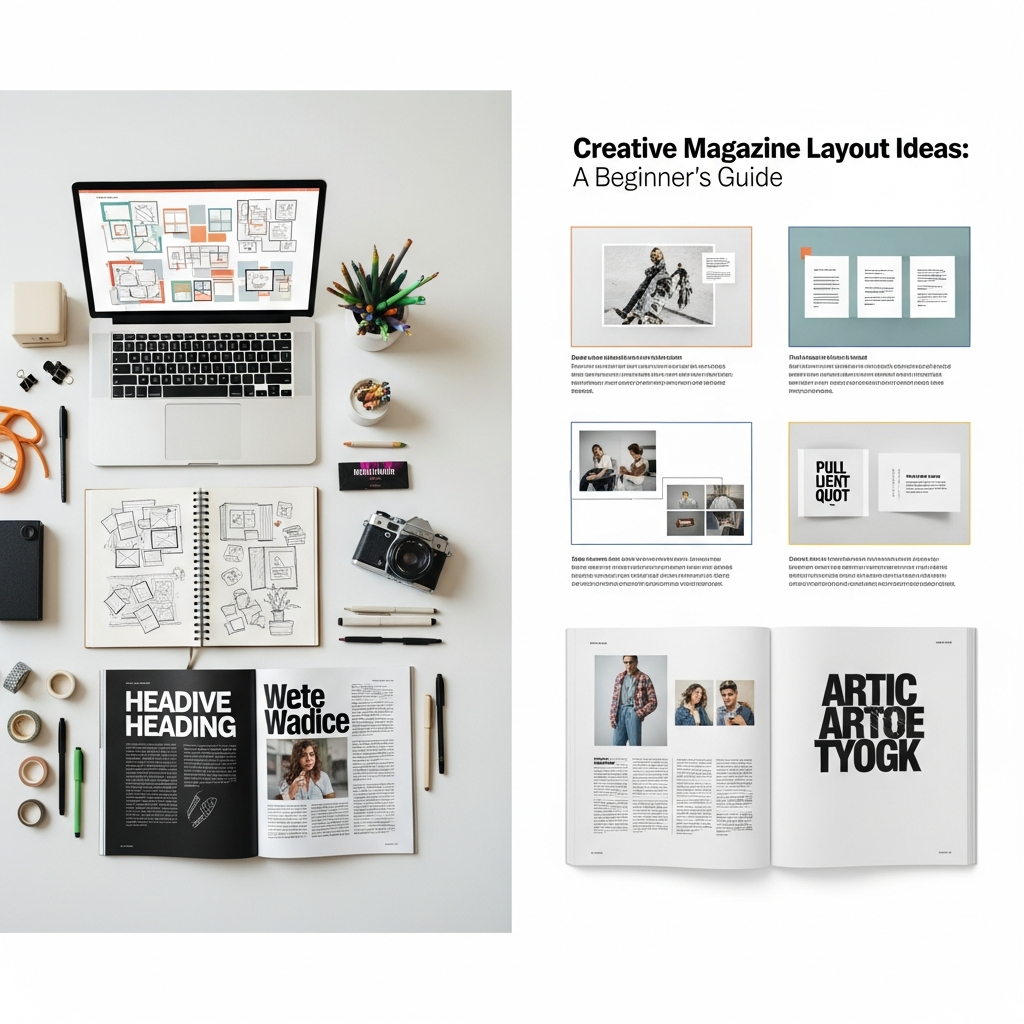
The world of print and digital publishing remains vibrant, offering a fantastic canvas for visual storytelling. If you are just starting out, mastering how to structure your pages is the key to creating a memorable publication. This comprehensive Creative Magazine Layout Ideas Guide For Beginners will help you understand the essential elements needed to design a publication that draws readers in and keeps them engaged from cover to cover. Successful magazine layouts rely on four fundamental principles: Visual Hierarchy (directing the reader’s eye), Readability (ensuring text is easy to consume), Balance (distributing weight across the spread), and Consistency (using a uniform style). Grasping these basics is the foundation for developing truly creative and effective layouts.
What are the Essential Elements of a Great Magazine Layout?
A compelling magazine layout, whether for a print or digital publication, isn’t just about placing pictures and text; it is about organizing content into a narrative structure that is both beautiful and functional. Understanding the fundamental components is the first step in this Creative Magazine Layout Ideas Guide For Beginners. Mastering these parts will allow you to build complex, engaging pages that truly resonate with your audience.
| Element | Description | Why It’s Important |
| :— | :— | :— |
| Grid System | A framework of columns and rows defining content placement. | Provides structure, consistency, and alignment. |
| Visual Hierarchy | Using size, contrast, and placement to indicate importance. | Guides the reader’s attention, starting with the most important elements. |
| Negative Space | The empty, unmarked areas around and between design elements. | Essential for balance and readability, preventing clutter. |
| Typography | The style and appearance of text, including font choice and size. | Defines the tone and legibility of the entire magazine. |
These elements work together to ensure that even a complex layout remains clean and easy to navigate.
Understanding the Cornerstone: The Grid System
The grid system is the silent hero of any great layout, providing a non-visual structure that dictates where text and images should live. For any newcomer diving into this Creative Magazine Layout Ideas Guide For Beginners, adopting a robust grid system is crucial. Think of the grid as the architectural blueprint for your magazine; it ensures all pages within an issue feel connected and professional.
Choosing Your Grid Type:
- The Column Grid: This is the most common format. Magazines typically use a two-, three-, or four-column grid. A three-column grid, for example, offers great flexibility, allowing you to use one large image across all three columns or combine a two-column text block with a single-column sidebar. This provides a versatile foundation for any Creative Magazine Layout Ideas Guide For Beginners.
- The Modular Grid: More complex, this grid uses rows in addition to columns, creating modules (rectangles). This is perfect for magazines with diverse content types, like business or scientific publications, where you need to organize multiple small elements (charts, footnotes, sidebars) clearly.
- The Manuscript Grid: This simple, single-column grid is best for publications that are heavily focused on long-form, uninterrupted text, like literary journals. While simpler, you still need strong principles of margin and white space to keep it engaging.
The power of a grid lies in its consistency. Once you set your margins, column widths, and gutter (the space between columns), you must stick to them. This repetition is what creates a rhythmic, professional feel, ensuring readers never feel lost or disoriented as they flip through your pages. Even the most innovative layout ideas still rely on a solid, invisible grid foundation.
The Art of Negative Space (White Space)
Negative space, often called white space, is perhaps the most misunderstood element in this Creative Magazine Layout Ideas Guide For Beginners. Beginners often feel the urge to fill every inch of the page, but empty space is just as important as the content itself. It gives the reader’s eye a place to rest and separates conflicting elements.
Effective use of negative space is a sign of sophistication in design. When you have a complex layout, generous white space around the focal point—be it a striking photograph or a major headline—draws immediate attention to that element. Furthermore, proper spacing between lines of text (leading) and between words allows for greater reading comfort, which is non-negotiable for any successful layout. Using negative space thoughtfully can immediately elevate your designs and is key to unlocking the true potential of any Creative Magazine Layout Ideas Guide For Beginners concept. It suggests confidence in your design choices, allowing the content to breathe.
Trending Creative Magazine Layout Ideas Guide For Beginners
Staying current with visual trends is crucial. While the basic principles of design remain constant, the execution evolves. The modern reader is accustomed to dynamic, digital-first layouts. Integrating contemporary flair into your design is what separates a good magazine from a great one. These examples are perfect starting points in your Creative Magazine Layout Ideas Guide For Beginners journey.
Dynamic Layout Idea 1: The Asymmetrical Balance
Forget the stiff, mirrored spreads of the past. Asymmetrical balance involves arranging elements of different weights and sizes on a spread so that they visually balance each other out, even without being perfectly centered. This design approach creates tension and movement, making the page feel more dynamic.
How to Execute Asymmetrical Balance:
- The Large/Small Pairing: Place a single, dominant element (a large, high-impact photo) on one side of the spread, then balance it with a cluster of smaller elements (three columns of text, a smaller pull quote, and a tiny accompanying graphic) on the opposite side. The visual weight is equalized, but the layout is more interesting. This concept is a staple in any modern Creative Magazine Layout Ideas Guide For Beginners.
- The Color Counterpoint: Use a neutral or monochrome background for most of the page, and balance the weight of a heavy text block with a splash of bold, unexpected color in a graphic element on the opposite page.
- Emphasizing Verticality: Instead of standard horizontal blocks, use long, narrow vertical images or text columns. This breaks the expected flow and forces the eye to travel differently. This technique is especially effective for fashion or architectural publications that want to introduce fresh Creative Magazine Layout Ideas Guide For Beginners.
This method introduces an element of surprise and modernity. A magazine using asymmetrical balance feels edgy and engaging, perfect for niche publications targeting younger, visually-sophisticated demographics. Statistics show that dynamically balanced pages often increase the time readers spend on a spread, as the eye is constantly stimulated by the varied composition.
Dynamic Layout Idea 2: Typography as the Main Image
In 2026, one of the biggest Creative Magazine Layout Ideas Guide For Beginners trends is utilizing typography itself as a primary visual element, sometimes replacing a photograph entirely. This isn’t just about picking a good font; it’s about treating the words—specifically the headlines and pull quotes—as illustrations.
Key Typography Trends for 2026 Layouts:
- Bold, Chunky Type: Oversized, heavy, and even distorted slab serif or sans-serif fonts are in demand. They command attention and become the visual anchor of the page. Designers often let the type bleed off the page or overlap with images to create depth and texture, which is a fantastic technique to learn from this Creative Magazine Layout Ideas Guide For Beginners.
- Animated and 3D Fonts: While challenging for traditional print, digital magazines are leveraging 3D and interactive typography that moves or changes perspective, creating a highly engaging, immersive experience. This pushes the boundaries of typical layout design.
- Ornamentation and Vintage Revival: There’s a notable movement toward typography inspired by historical styles like Art Nouveau or geometric fonts from the mid-century. These ornamental elements can be integrated into the layout as borders or decorative flourishes around the main body copy.
For a beginner, the easiest way to incorporate this is by finding a pull quote—a short, powerful phrase from the article—and blowing it up to fill the entire center gutter or a full half-page. Use a high-contrast color against a simple background. This instantly creates a striking visual without the need for complex photography, embodying the spirit of this Creative Magazine Layout Ideas Guide For Beginners.
Dynamic Layout Idea 3: The Minimalist & Functional Approach
While bold colors and maximalism have their place, the “Simplicity and Sophistication” mantra is dominating magazine design in 2026. This means embracing a minimalist aesthetic where every element has a purpose and clutter is ruthlessly eliminated. This approach in a Creative Magazine Layout Ideas Guide For Beginners prioritizes clarity above all else.
Characteristics of Minimalist Magazine Layouts:
- Plenty of Negative Space: White space is not just for resting; it’s a deliberate design element that highlights the content. It gives the content “air” and makes the whole page feel exclusive and high-end.
- Monochromatic or Limited Color Palettes: Designers often stick to black, white, and one accent color (like a deep blue or a vibrant yellow). This limited palette emphasizes texture and typography rather than overwhelming the reader with hues.
- Strict Adherence to the Grid: Minimalist designs are inherently structured. The columns and baselines must be perfect because any misalignment will be glaringly obvious when there are fewer elements to distract the eye.
This style of Creative Magazine Layout Ideas Guide For Beginners is fantastic for luxury, art, and corporate publications. It conveys professionalism and focus. By simplifying the visual language, the designer ensures that the message of the article becomes the star. It proves that sometimes, the most creative ideas come from taking things away, not adding them.
Dynamic Layout Idea 4: Merging Hand-Drawn and Digital Elements
A fascinating trend emerging in the latest Creative Magazine Layout Ideas Guide For Beginners is the blending of organic, hand-drawn elements with sharp, digital graphics. This creates a unique texture and warmth that is often missing in purely digital design. It’s a way to humanize the slick, polished look of a magazine.
Illustrated Highlights: Instead of using standard box graphics or charts, designers are using rough, sketchy illustrations to highlight key data points or quotes. These can be simple lines or colorful doodles that seem to have been drawn over* the printed text.
- Custom Borders and Scribbles: The edge of a photo might be given a hand-drawn border, or a messy line could connect a caption to its corresponding image. This technique breaks the rigidity of the grid and gives the impression of a personal, artisanal touch.
This method works incredibly well for lifestyle, food, and culture magazines. It injects personality and quirkiness, making the reading experience feel less formal and more intimate. Incorporating this into your Creative Magazine Layout Ideas Guide For Beginners can provide a distinct, proprietary look that is hard to replicate.
Building the Foundation: Key Layout Components Explained
To execute the modern, creative ideas mentioned above, a beginner needs to master the traditional, structural components of a magazine spread. Every effective design in this Creative Magazine Layout Ideas Guide For Beginners is built upon these elements.
Mastering the Hierarchy of the Headline and Deck
The headline (or title) is your page’s promise; the deck (or sub-headline) is the first taste of what the reader will get. Their design must immediately communicate the article’s importance and tone.
- Size and Weight: The headline should always be the largest and boldest element on the page, the number one point in the visual hierarchy. For a truly striking Creative Magazine Layout Ideas Guide For Beginners idea, the headline should occupy significant space, sometimes even spilling across the gutter onto the opposite page.
- The Deck’s Role: The deck copy should be noticeably smaller than the headline but still larger than the body copy. Its purpose is to provide context and elaborate on the headline without being redundant. A general rule is to use a contrasting typeface (e.g., if the headline is a heavy sans-serif, the deck could be a delicate serif).
- The Power of Placement: Consider placing the headline unexpectedly—perhaps far down the page or right at the edge of the gutter—to add visual intrigue. This departure from the standard centered or top-aligned placement is a strong Creative Magazine Layout Ideas Guide For Beginners move, especially in feature spreads.
A magazine spread’s success is often determined in the first two seconds, based on how well the headline and deck grab the reader. If the headline is weak or poorly integrated into the layout, the reader is likely to skip the entire article.
Images: The Focal Point of Creative Magazine Layout Ideas Guide For Beginners
In contemporary magazine design, images often carry equal, or even greater, weight than the text. They provide emotional context and break up large text blocks.
Types of Image Use in Layouts:
- The Full-Bleed Hero Image: This image extends to the absolute edge of the page, sometimes across the entire spread. It’s best used for opening spreads or for high-impact photography that requires immersion. This is a classic and reliable Creative Magazine Layout Ideas Guide For Beginners technique.
- The Inset/Framed Image: The image is smaller, placed within the text block, and has distinct negative space around it. This works well for supplementary photos (e.g., portraits of sources or detail shots) that don’t need to dominate the page.
- Image Clusters/Montages: Using several smaller images grouped together to form a visual mood board or a series of interconnected details. This is an excellent way to balance out a spread that has a lot of content, giving the reader multiple points of visual interest simultaneously.
Crucial Image Placement Rule: Never cut an image in half with the gutter unless it is an intentional artistic choice where the subject is clear on both sides. Beginners should generally avoid this, especially when experimenting with new Creative Magazine Layout Ideas Guide For Beginners. Focus instead on letting the image dominate one side of the spread while the text lives on the other.
Body Copy and Readability: The Gutter, Margins, and Leading
No amount of creativity can save a layout if the body copy is painful to read. Readability is paramount. This section of the Creative Magazine Layout Ideas Guide For Beginners focuses on the technical aspects that ensure comfortable consumption of content.
- The Gutter: The gutter is the blank space where the two pages meet at the fold. You must ensure text does not run too close to the gutter, as it gets lost or distorted when the magazine is bound. Always keep a generous inner margin.
- Margins: The space surrounding the content area. Wider margins (especially the outer margin) make the page feel more open and expensive. A common creative technique is to use the outer margin for small, contextual notes, captions, or even page numbers, freeing up the main content area.
- Leading (Line Spacing): The space between lines of text. Too tight, and the text looks cramped; too wide, and the reader loses their place. A good rule of thumb is to set the leading to about 120-145% of the font size. For example, a 10pt font would have a 12pt to 14.5pt leading.
By paying meticulous attention to these microscopic details, you ensure that the reading experience is smooth, which is the ultimate goal of any well-designed magazine spread, regardless of the specific Creative Magazine Layout Ideas Guide For Beginners you choose to implement.
Advanced Creative Magazine Layout Ideas Guide For Beginners Techniques
Once you have mastered the basics of grid, hierarchy, and type, you can start experimenting with more sophisticated techniques that give your publication a truly unique voice. These advanced strategies will distinguish your work from standard template-based designs and are essential components of a complete Creative Magazine Layout Ideas Guide For Beginners.
The Unexpected Cropping and Text Wrap
Standard layouts keep text in neat rectangles. A more Creative Magazine Layout Ideas Guide For Beginners approach involves breaking these boundaries.
- Text Wraps: Use the contour of an image to define the boundary of your text block. For example, if you have a photo of a subject’s profile, the text can wrap tightly around the curve of their head and shoulder before snapping back to the standard column width. This creates a visually arresting, custom shape.
- Unusual Cropping: Don’t just crop images into perfect squares or rectangles. Crop dramatically! Cut off the tops of heads, focus on minute details, or use extreme close-ups. This sense of fragmented reality can imply a deeper narrative or create an artistic mood. For example, a fashion magazine might crop a model’s outfit to focus solely on the texture and silhouette, forcing the reader to engage with the abstract design rather than the portrait itself.
The Power of Color and Contrast
Color is an emotional tool that communicates mood, brand identity, and focus. An often-overlooked area in the Creative Magazine Layout Ideas Guide For Beginners is the use of color only to distinguish content types.
- Spot Colors for Emphasis: Use a single, distinct color (a spot color) exclusively for pull quotes, section headers, or page numbers. This creates visual markers that guide the reader through the text, making the content more scannable. A study in design perception indicated that the strategic use of a spot color can increase the perceived importance of a text block by 30% without changing the font size. This is a very powerful Creative Magazine Layout Ideas Guide For Beginners trick.
- Color Blocking: Instead of using a colored background for the whole page, use a solid block of color to contain a specific piece of information, like a sidebar, an introductory note, or a glossary. This visually separates the content and adds a dynamic, graphic element to the spread. This specific style works perfectly for a modern Creative Magazine Layout Ideas Guide For Beginners.
Integrating Infographics and Data Visualizations
In today’s data-driven world, a successful magazine often needs to translate complex statistics into easily digestible visual formats. This requires more than just a simple bar chart.
- The Narrative Infographic: Instead of isolated graphs, integrate the data visualization into the flow of the article. Use creative icons, custom illustrations, and a narrative structure to explain the data. For example, rather than a pie chart showing resource distribution, use an illustration of a stylized hand distributing coins to various labeled destinations, which makes the concept much more tangible.
- Visual Listicles: For a simple list, don’t use standard bullet points. Instead, design custom numbers or icons that reflect the magazine’s tone. Perhaps each point is contained within a stylized burst or a hand-drawn circle. This is an easy way to apply Creative Magazine Layout Ideas Guide For Beginners to mundane lists, making the entire piece feel more cohesive and professional.
Practical Workflow: Implementing Your Creative Magazine Layout Ideas Guide For Beginners
Having great ideas is one thing; bringing them to life is another. Your workflow needs to be structured to ensure consistency and efficiency, especially when trying to maintain the integrity of your Creative Magazine Layout Ideas Guide For Beginners vision across an entire issue.
The Master Page Strategy
Before you place any content, you must design your Master Pages (or Parent Pages, in some software). This is where you set the global rules for the entire publication. This is a non-negotiable step in any Creative Magazine Layout Ideas Guide For Beginners.
What Master Pages Define:
- The Grid: Set the column guides, gutters, and margins.
- Global Elements: Place page numbers, recurring headers/footers, and the name of the magazine or section title.
- Visual Identity: Define the default font styles for body copy, captions, and sidebars.
By designing your Master Pages first, you guarantee that every page you create automatically conforms to the structure defined in your Creative Magazine Layout Ideas Guide For Beginners. You will only need to override these settings on pages that demand high customization, such as the feature opener. This saves immense time and ensures a professional level of uniformity.
Iteration and Mock-ups
Design is rarely perfect on the first try. You must be willing to iterate and mock up your ideas.
- Sketching (Thumbnails): Before touching design software, take 5-10 minutes to sketch out several different Creative Magazine Layout Ideas Guide For Beginners for a single spread. Use simple boxes to represent text, and scribbles for images. This forces you to focus on structure and flow before getting distracted by color or font choices.
- Rough Digital Mock-up: Use low-resolution, placeholder images and ‘lorem ipsum’ text to build a rough version of the layout in your software. Focus solely on the placement of major elements (headline, main image, body text blocks).
- Refinement: Only once the structure is approved should you finalize the typography, refine the color palette, and insert the final high-resolution images. This methodical approach ensures that your core Creative Magazine Layout Ideas Guide For Beginners is structurally sound before you start polishing the details.
Frequently Asked Questions (FAQ)
Is it necessary to use a grid for a creative layout?
Yes, absolutely. A grid system is essential even for the most unconventional and Creative Magazine Layout Ideas Guide For Beginners. The grid is the invisible spine of the publication; it provides consistency, ensures all elements align visually, and allows you to create dynamic tension by deliberately breaking the grid in specific, meaningful ways. Without a grid, your pages will look messy and arbitrary, losing the professionalism that readers expect. The grid actually enables creativity by providing a reference point for visual contrast.
What is the most common mistake beginners make with magazine layouts?
The most common mistake is failing to utilize negative space, often referred to as “filling the canvas.” Beginners often try to squeeze too much text and too many images onto a single page, resulting in a cluttered, overwhelming, and uninviting spread. A key lesson in any Creative Magazine Layout Ideas Guide For Beginners is that allowing generous white space around key elements—headlines, images, and pull quotes—makes the page feel sophisticated, highlights the content you want readers to see, and significantly improves readability.
How do I choose the right font combination for a magazine?
The best magazine font combinations rely on contrast and harmony. Start by choosing a serif font (like Garamond or Lora) for your body copy, as serifs are generally considered easier to read in long blocks of text. Then, pair it with a contrasting sans-serif font (like Helvetica or Montserrat) for headlines, subheadings, and captions. This contrast creates visual hierarchy. When exploring different Creative Magazine Layout Ideas Guide For Beginners, avoid combining two overly decorative or two very similar fonts. Stick to one clear, readable font for the body copy, and use one strong, character-filled font for your display text.
How do I ensure my magazine looks consistent across different articles?
Consistency is achieved through the disciplined use of Master Pages and Style Sheets. Use Master Pages to set the structure (grid, margins, page numbers) for the entire magazine. Then, use Paragraph and Character Styles to define the exact appearance of every text element (e.g., “Body Copy,” “H1 Feature,” “Caption,” and “Pull Quote”). By applying the same named style to all articles, you ensure that every article, regardless of its unique Creative Magazine Layout Ideas Guide For Beginners, adheres to a unified visual language, making the entire publication feel cohesive and professional.
Should I prioritize photos or text when designing an opening spread?
For the opening spread of a feature, you should generally prioritize the visual impact of the photo and the headline. The goal of the opening spread is to hook the reader immediately. This means using a high-impact, full-bleed (or near full-bleed) image combined with an oversized, dominant headline. The body text should be minimal, perhaps just a deck or the first introductory paragraph. This Creative Magazine Layout Ideas Guide For Beginners approach establishes an emotional connection, turning the page into an advertisement for the article itself.